| about | works | resume | contact |

"Dairy" is a journaling app that aims to reflect users' tasks on physical journals. It combines both a diary (reflective) and a planner (future-planning) in the app, while using appropriate technology for improving the usability. The app was designed using the Agile Methodology, which included iterative development and constant feedback from users.
Here is a TLDR (too long didn't read) infographic of my process!
For my final semester, I worked individually for 12 weeks. I wanted to exercise my ability to practise the agile process on my own, while merging it with something I was interested in.
Time is important, and one way for people to organise their time in an efficient way is to use diaries. Writing can also be therapeutic for people, and while it can help people be organised, it can keep their goals on track, and it can help the brain regulate emotions too.
With physical planners, people also seem to like that it leads them away from digital screens. I want to be able to explore ways to allow something physical be digital, using users’ needs and requirements. I am aware that there are existing planner applications that aren’t seamless to users. One of the reasons as to why it may not me usable, is that it may not be designed with the users tasks and goals in mind.
There are few disadvantages of using physical planners, such as having to remember to bring a physical book around, needing to buy new planners when the pages run out, having no back-up and the divide from the digital integration. Hopefully designing a user-centred application would allow the participants to think about using a different way to use planners with efficiency and with the help of technology.
I really wanted to expand my knowledge and grow my empathy with potential target users, so I tried to find as much information as I could. I wanted to limit the amount of assumptions I was going to make, and by doing a lot of documentation, I felt like it helped me somewhat tone down the assumptions.
I set up my survey on Google Forms to allow me to gather insights and thoughts from a group of people. I already knew the participants, so I knew that they weren’t going to be digital diary users, but I still had a journey for that route.
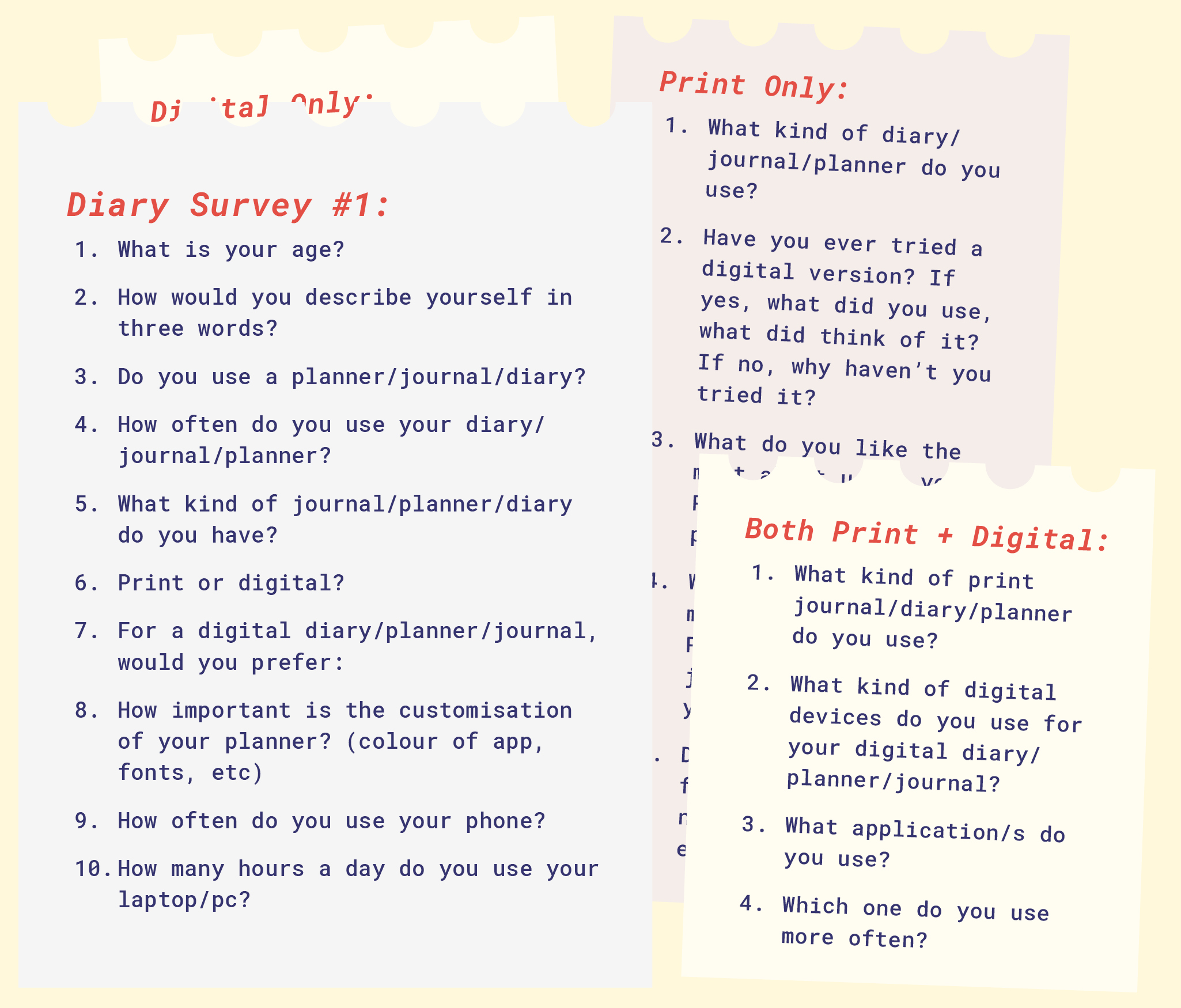
Results
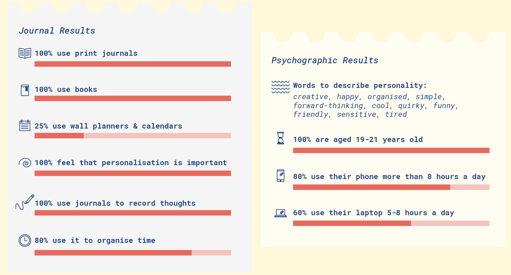
To summarise, I found that 100% of the participants use books as planners, and 100% of the participants use the journals to record thoughts, compared to 80% who use it to organise time. I thought this was interesting as it would inform me of the interface metaphors I could use. 100% thought that personalisation is important with their diaries.
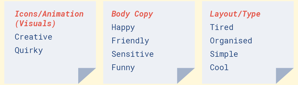
I also gathered the adjectives the participants used to describe themselves to help me create personas, and inform me of some design decisions. 80% of the participants use their phones, and from this, I will decide to use mobiles phones as the medium for my project.
With the adjectives that my participants have given me, and I decided to group words together to help inform the design of my app, in terms of icons/animations, body copy and the layout. I also noted down the favourite things that people had about their diaries, their dislikes, and the other uses.
After being sent photos of journals and planners by participants, I analysed the pages they submitted so I could determine what kind of notes they make, tools they use and decorations they use. It can help me determine what kind of features my app would need to support the users’ needs in the digital realm, using the physical world.

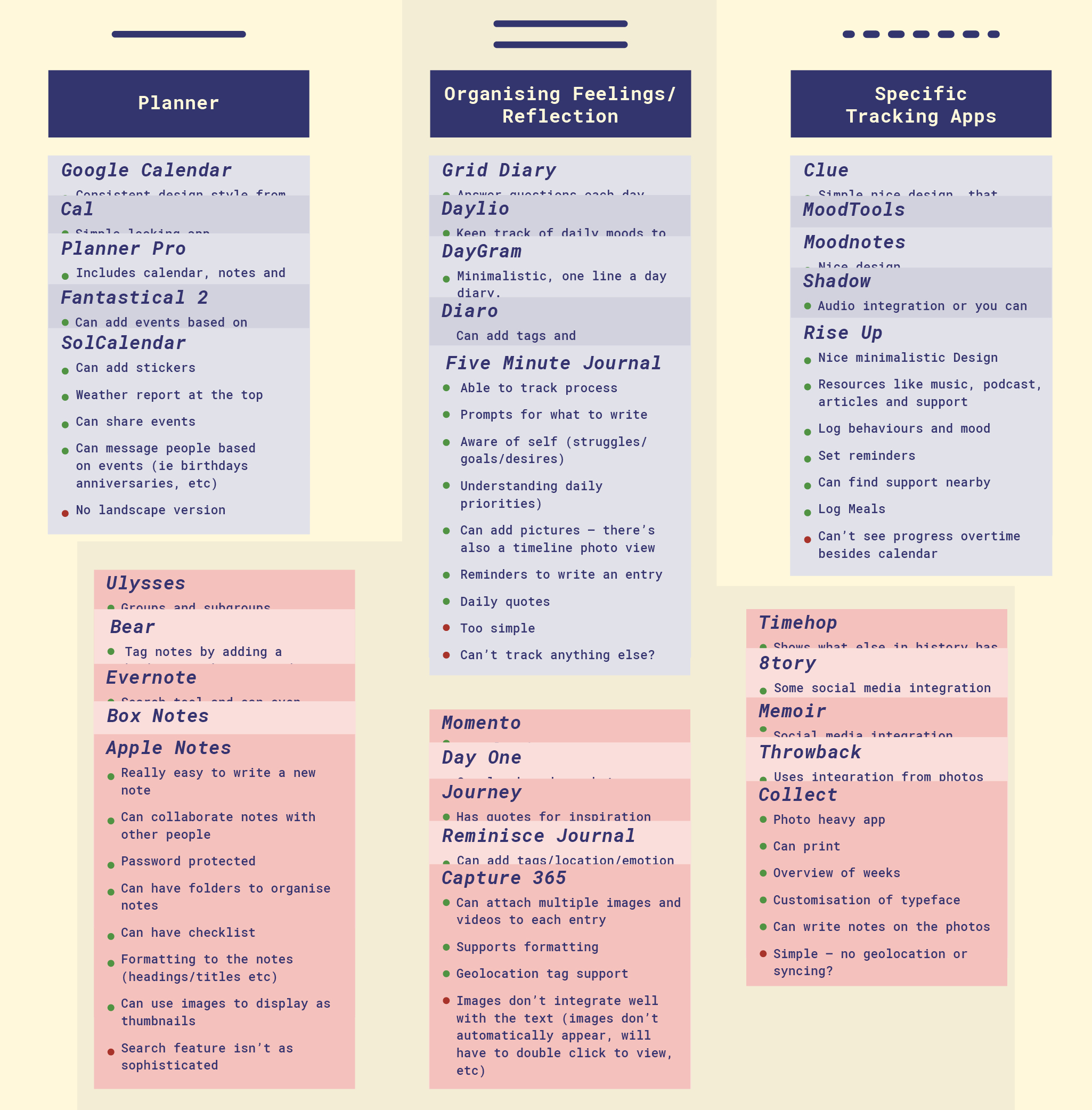
I researched some existing mobile applications to see what had already been done, what the patterns are, and where I could situate my project. I downloaded some of the apps to get an idea of their patterns. I also looked at review sites, youtube videos, and reviews on the app store to gather what people thought about the apps that they use.
I found that these apps were basically split into three categories: reflection apps (diaries), organisers (planners) and tracker apps.
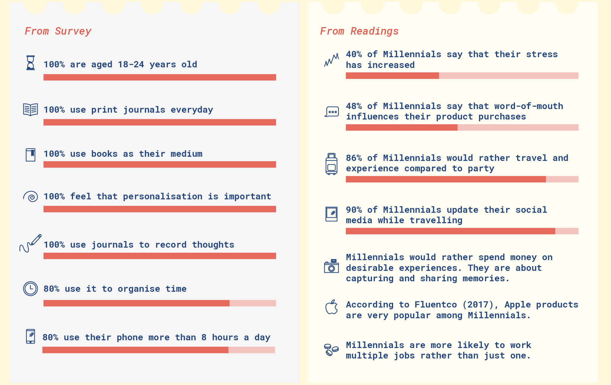
Based off the survey and the research that I have done, I rounded up the main attributes for a psychographic group I am targeting.
I had created personas to help me empathise with users, with their habits, lifestyle and personalities mirroring the research. These personas are basic, from their demographics to their technical ability.

I also had done some empathy maps for me to fully understand the users. This also allowed me to create personas that were different enough (although were in the same psychographic group) for me to develop different aspects of the app.

From the research, I devised a set of requirements for the app.
Functional Requirements:
The product should take entries whether it be notes/plans and track users’ entries over time to give them trends/patterns to help them in the future – organise time/predict moods/remember notes etc.
Data Requirements:
Geolocation data (time/date/location/weather) for tracking purposes. Written entries from the user, and some ranking entries (in terms of mood). Data needs to be kept secure and will not be deleted unless the user wishes to delete any information.
Environmental Requirements:
Users will be using this app most likely in short bursts during the day (and night), rather than using it for longer duration per use, so the app will need to allow to be opened and closed without disrupting the information/flow of the app. Data will be shared to other people if the user chooses to share their information with other people (in the form of reminders, or sharing memories). It will also be designed for the mobile phone thus some patterns from mobile phone pattern library will need accounted.
User characteristics:
18-25 year olds who are technologically savvy, and who primarily use print diaries.
Usability Goals:
The app will need to be effective – in terms of how good this app is at doing what it’s supposed to do. This would primarily the tracking trends feature. The app will also need to be efficient, as it is taking something print and using technology to optimise features that something print is unable to do. The app should also be easy to learn and easy to remember how to use. The users may not use this app daily, and hopefully will remember how to use the app without needing a tutorial.
User Experience Goals:
The app will need to be motivating, emotionally fulfilling and helpful for the users. The goal is for them to be organised – mentally, emotionally and physically.
I then wrote quick scenario stories to help bridge the gap between the personas and the app I will design. Each story makes use of their different personalities. This is so that the app will cater to the slightly different people, and will therefore have different tasks/features to give more dimensions to the app.
I created the scenario maps in conjunction to these stories. Doing the maps helped me think about each task for the user to get to their goal. I was able to think about the steps, questions/problems that arise and some ideas to fix those problems.
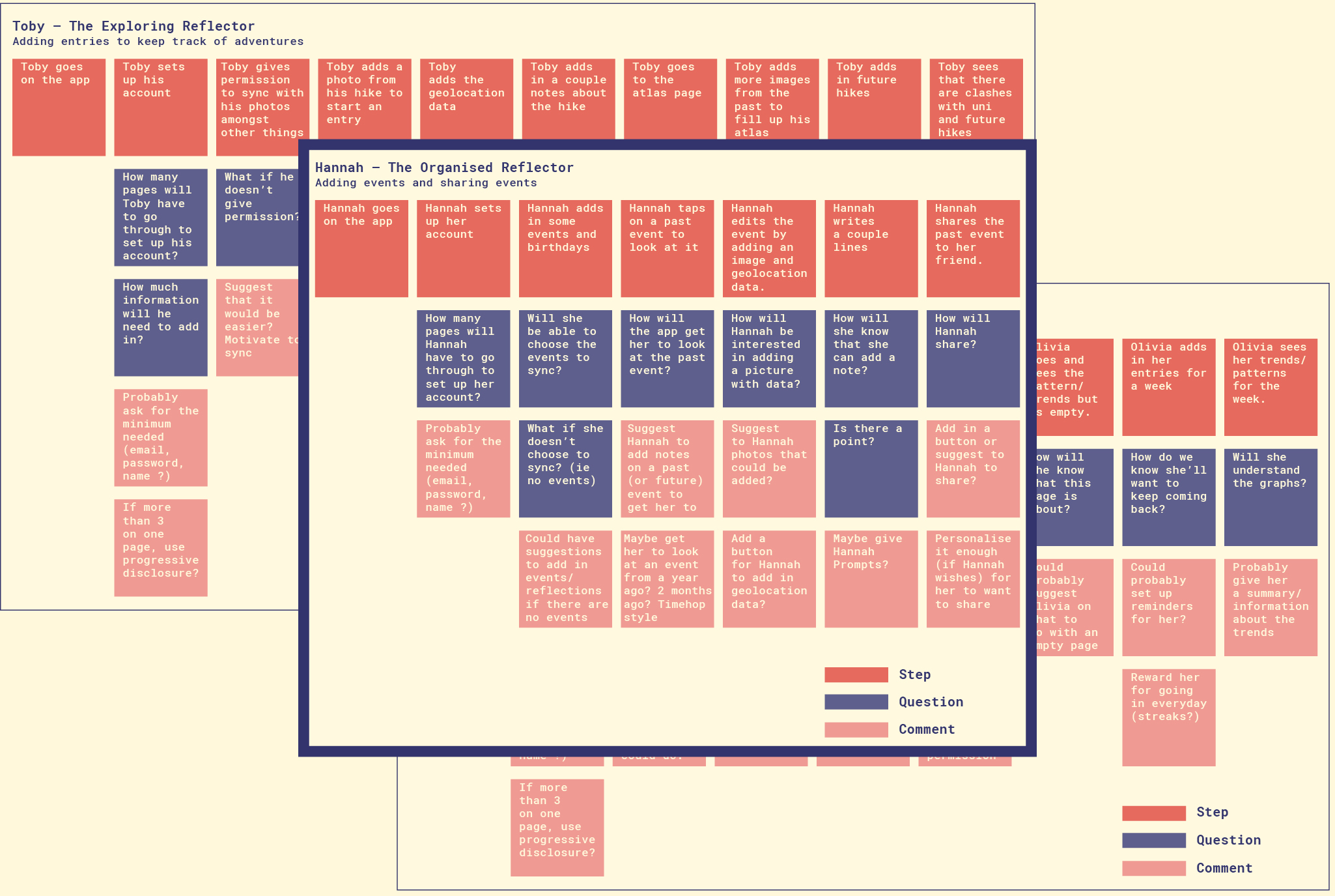
Extending the scenario maps, I thought of the main tasks/features that each persona would use in the app. I decided to use all of the personas, instead of just choosing one, as I felt like it would give me different dimensions to the application. It’s also a great exercise for me because I will need to empathise with three different characters, and thinking about what’s important for each persona. Doing this also allows me to pin point pain areas to cater to the different parts of the app which may be frustrating or least desirable for users to use.

I chose to use the Agile Methodology, which is based on iterative and incremental developments.
There is a lot of engagement between the client and the designer, and can be used for short-term projects with no clear requirements at the start. I wanted to explore designing a user-centred system, which allows me to test with users often and analyse the results to develop the application. The decisions were informed by the research at the start, and the feedback form the constant usability tests.
The main stages of the process are: research, design, prototype (this includes testing: and in the process there were 2 Heuristic Tests at the start and the end of the project, and 5 usability tests) and evaluation. Once a round is done, the cycle continues.
Instead of recounting the whole process, I chose to highlight some of the milestones that accelerated the development of the app.
Situating my app
After researching patterns from existing apps and analysing journal users’ journals and surveys, I found out where to situate my project. a lot of users seem to use their journals as an all-in-one solution, which informed me of trying to create an app that encapsulates what people do with their journals.
Describing words
In the survey, I also got participants to send me words to describe themselves, to help guide the aspects of my app. This also allows a personal connection between the feel of the app and the users due to those words.
Information Architecture:
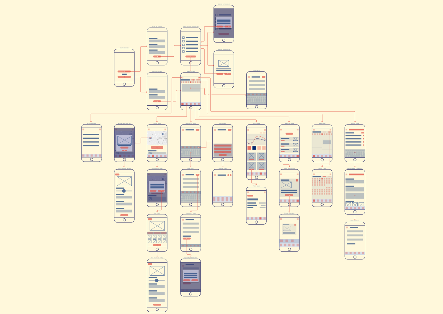
I had arranged a card sorting activity to figure out an information architecture that is the most usable and accessible for the app.

I then translated the results into an information architecture.

Refined Wireframes:
From the IA (and from the previous iteration), I refined the wireframes. This gave me an idea of the CTA and the elements on the page.
Style Guide:
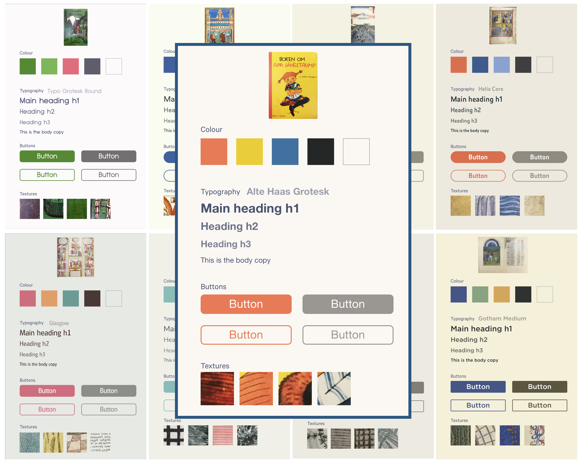
I also set up my design system, ready to give participants a more real and tactile feeling when going through the prototype of the application. the colours and textures is based on the book cover of “Pippi Longstocking by Astrid Lindgren (1950)”. Basing a colour system on a physical book allows something digital to have a connection to something physical.
Collage Feature:
I have added a collage feature to also reflect the scrapbooking/collaging activity. From testing, participants were successful with going through the tasks that dealt with the collage feature. This confirmed that I was going the right way.
The app's name:
I also had been thinking about a name for my app, and from research, I noticed that a lot of app names are an extension of what they do (eg diaro, momento, journey, etc) and I wanted to do the same, as well as reflect the words from above, thus choosing dairy! People always mix up diary and dairy and I thought that it would be funny and quirky to play on this. For branding, I then wrote dairy using dairy products to give an organic fluid and round form.

Interaction Maps:
I brought back the personas that I have created at the start. I looked at their goals and their tasks and commented whether the application answers those questions, or allows a way for users to do their tasks.

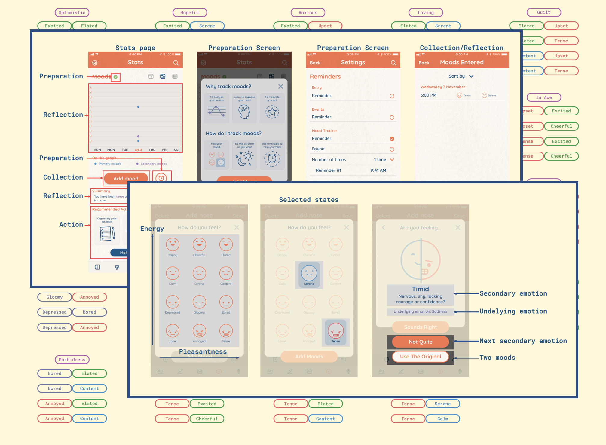
The Mood System:
In this iteration, I had done more research on the psychology of moods. Mobile apps for mood tracking: an analysis of features and user reviews. It gave me a stronger foundation for users to input how they feel.
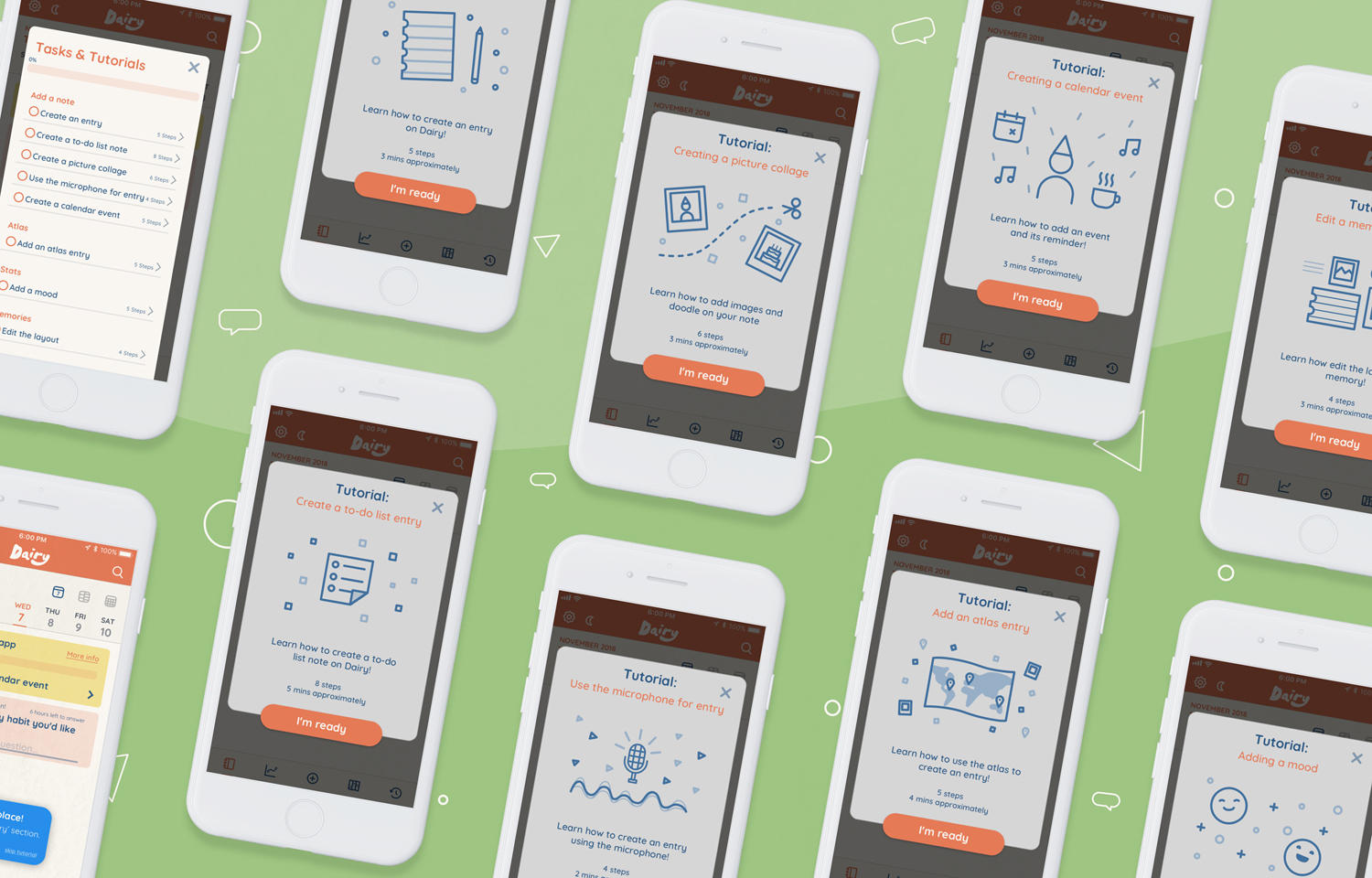
Learning Retention:
I also had added information cards, and hands-on tutorials which allows users to learn by doing, one of the best ways of information retention.

Accelerators:
From the iteration, I learned more about the way people use their phones especially with gestures, and how their mental models from using their own phones might affect how they use the app.
It also made me think about the long time users and the kind of things that would make their tasks and actions more efficient. According to Nielsen, a usable system must have accelarators for experienced users to allow them to carry their tasks in an efficient manner.
Refining:
Trying to think of the system as a whole. Refining some more visuals (icons mainly).

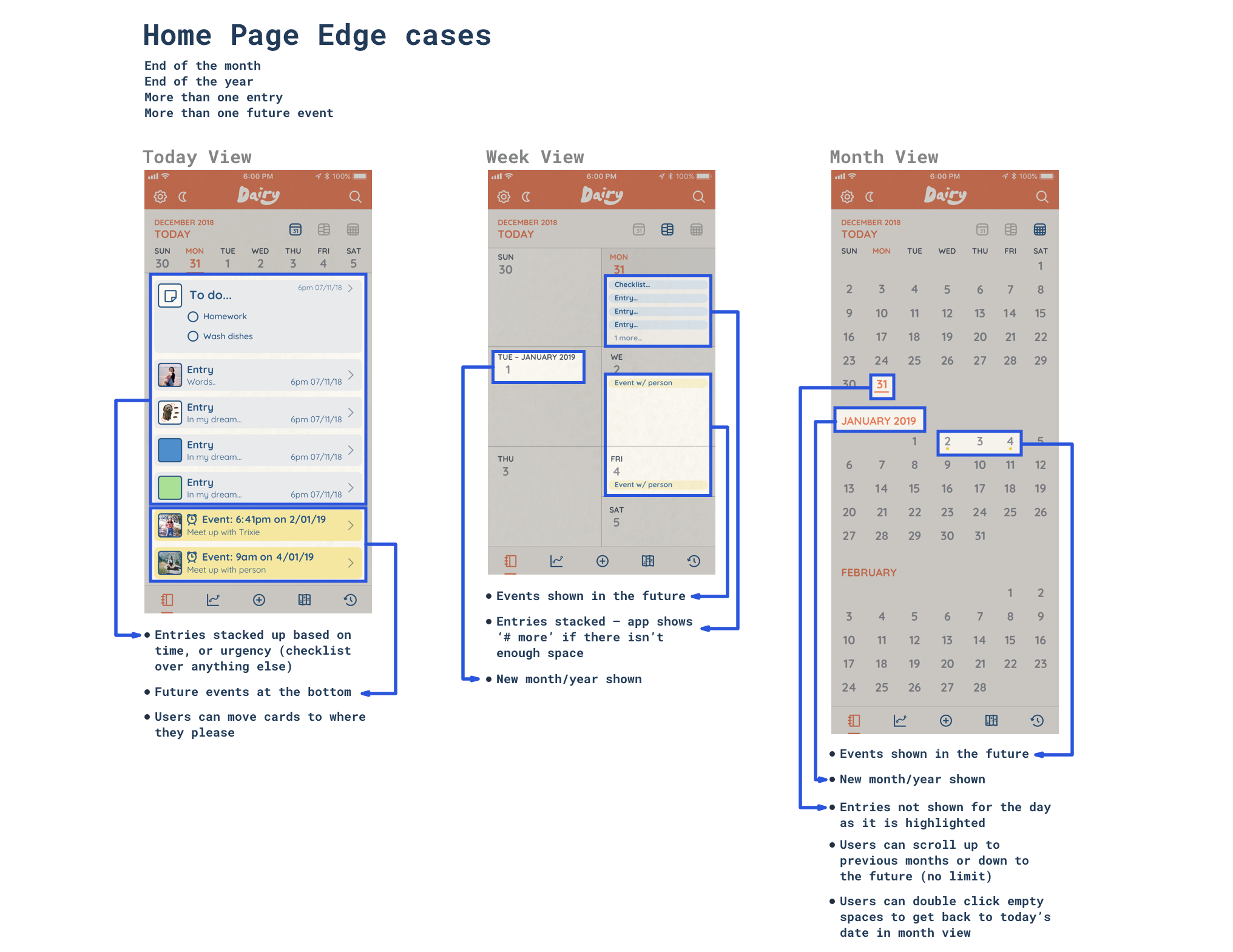
Edge Cases:
I kept this at the end because I feared that I wouldn't have enough time for the other items. I thought about edge cases and how this app would combat those.
Home screen and Memories page:
The Home screen is an organised way to look at your agenda.
The memories page collates your past entries in a new and visual way. The app learns what you want to show and what you don't want to show.
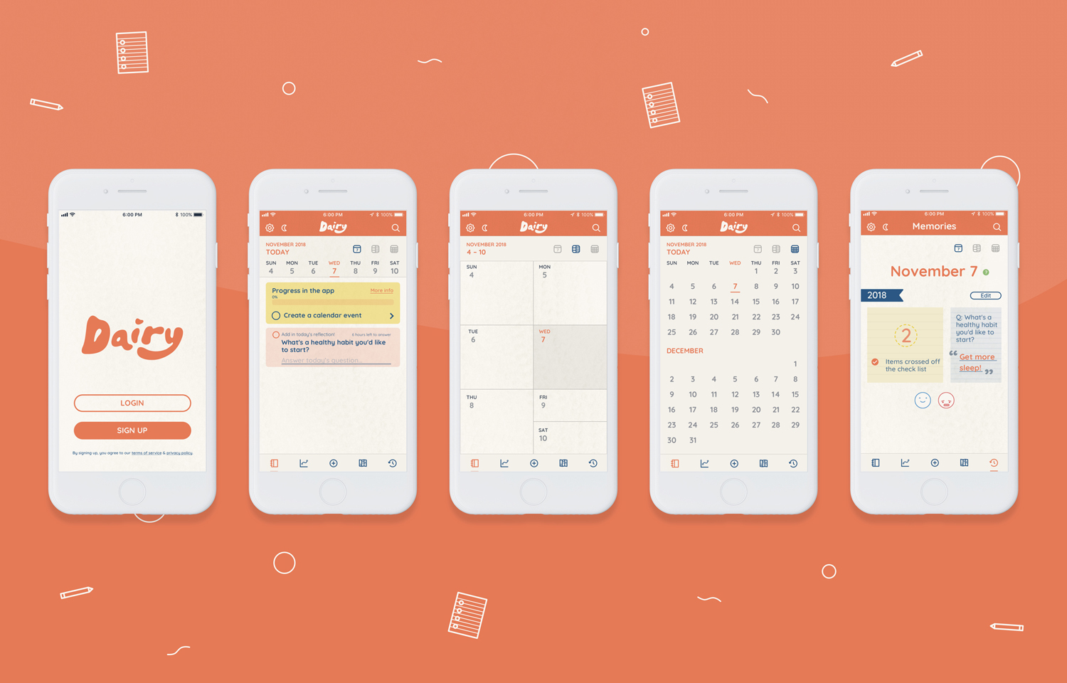
Add entry:
This part is a free form entry page – no forms to fill out! Users can take notes, create events, draw, make collages and even lock their notes.

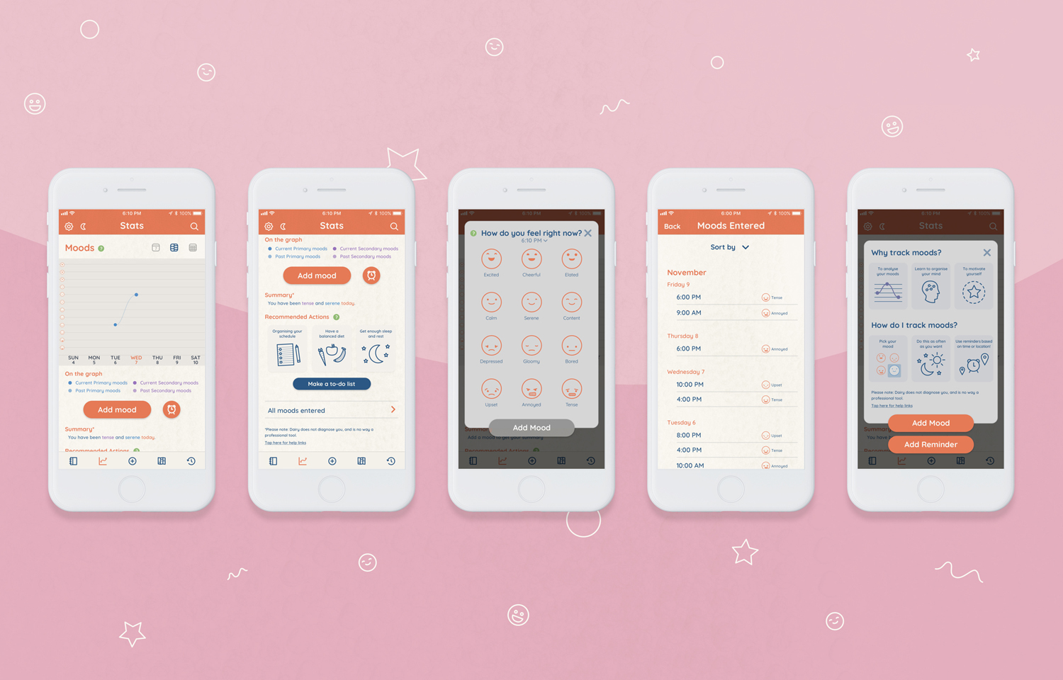
Stats Page:
Users can keep track of their moods with the stats page. Users will need to enter in their own moods. Dairy will summarise their moods, and recommend actions for them too.
Atlas Page:
Users can keep track their locations using the atlas page.

Tutorials:
Users can be guided by walkthrough tutorials!.
Here is the link to the prototype!
(MAC only!) If you don’t have mac, or don’t want to download the prototype, the video below will show you the content!
To open: Go to System Preference > Security and Privacy > General > ‘Open Anyway’
Here is the link to the full workbook with all my thoughts!
Warning: It's pretty long!
Towards the end of the semester, I felt like time was my biggest enemy and I was always trying to beat it. However, I am pretty happy with the outcome and the amount of iterations and content I’ve covered in the semester. I did wish that I had more time to come up with better tasks and survey questions to emulate how I imagine real users to act while using the app.
I would also love to explore designing this app for different devices, and how that could affect usability.