| about | works | resume | contact |
"Gravity" is a mobile application that lets a user find breweries based on their location. The application also helps them connect with beer and friends.
For the fall semester of 2017, my Usability and Design class got split into groups to design an application that centred around alcohol. My group consisted of Chris and Matt (both software developers) and I, (a designer).
We needed to find places of need within the alcohol culture, otherwise, what would the point of our proposed application be?
We initially did some research into some quick statistics about alcohol, and found that the craft beer industry is growing. In 2012, the craft beer market made up 10% of all beers sold, in 2015, that number increased to 19%. The trend continued, and in 2016, the number jumped to 21.9% (Snider).
Craft beer is a major part of beer sales, and there are plenty of opportunities for breweries to be a part of the market. Brand new breweries continue to pop up all over the world, and in 2016 alone, 826 new breweries opened, and only 97 were closed (Snider).
Our team proposed that this application would organise information about beers and breweries in an organised manner, to be a helpful and efficient tool.
We then noted three main user characteristics that would find our application useful. These were based on Garver’s findings:
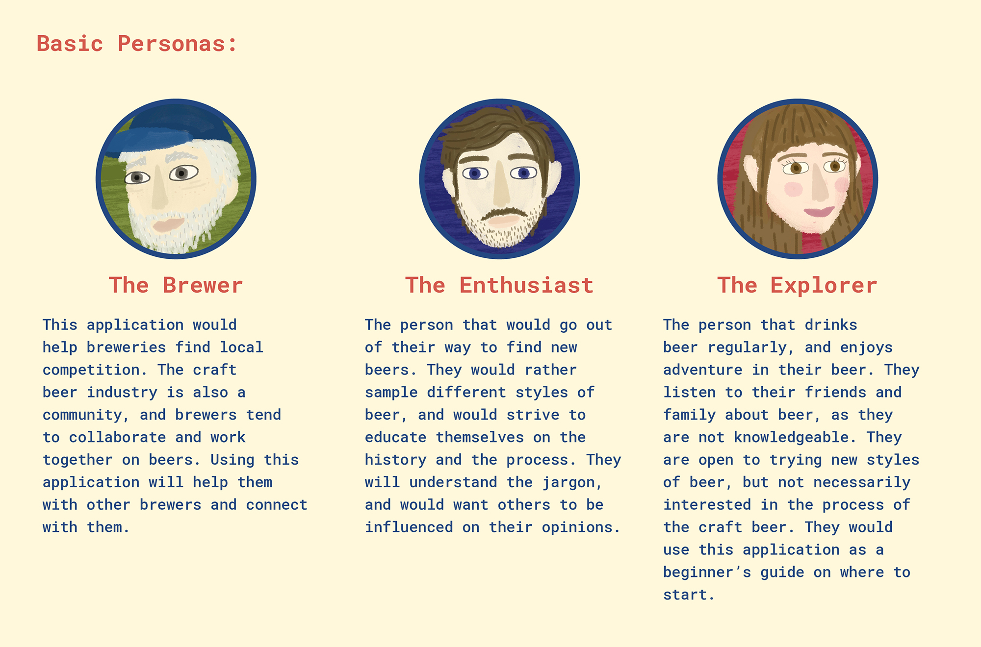
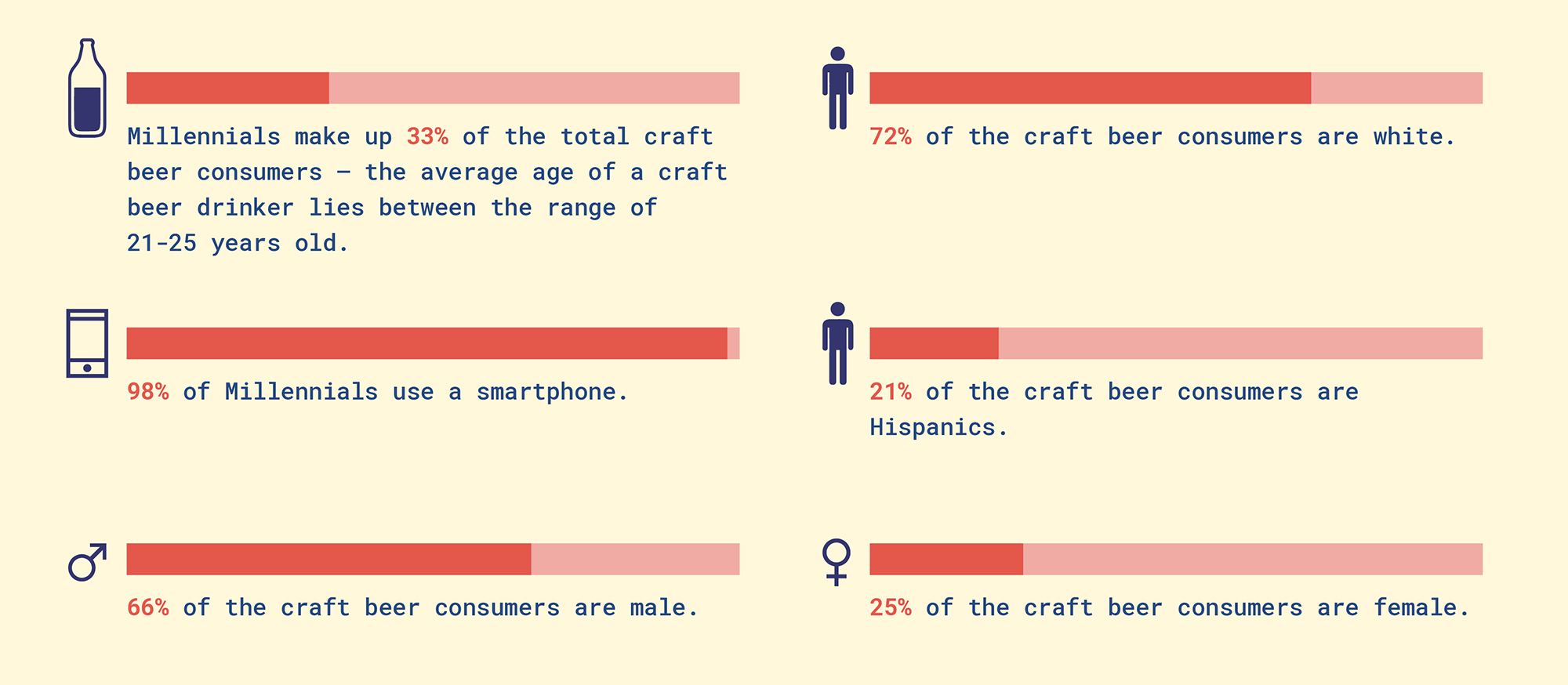
We looked at the craft beer industry and what kind of person drinks craft beer, and what their typical demographics are, to see what kind of mental models they might have that they would bring onto our proposed app.
From Pierre and Herz, we gathered that:
We looked at the craft beer industry and what kind of person drinks craft beer, and what their typical demographics are. We used the research from above to create personas to help us really understand what will be needed when designing this app.
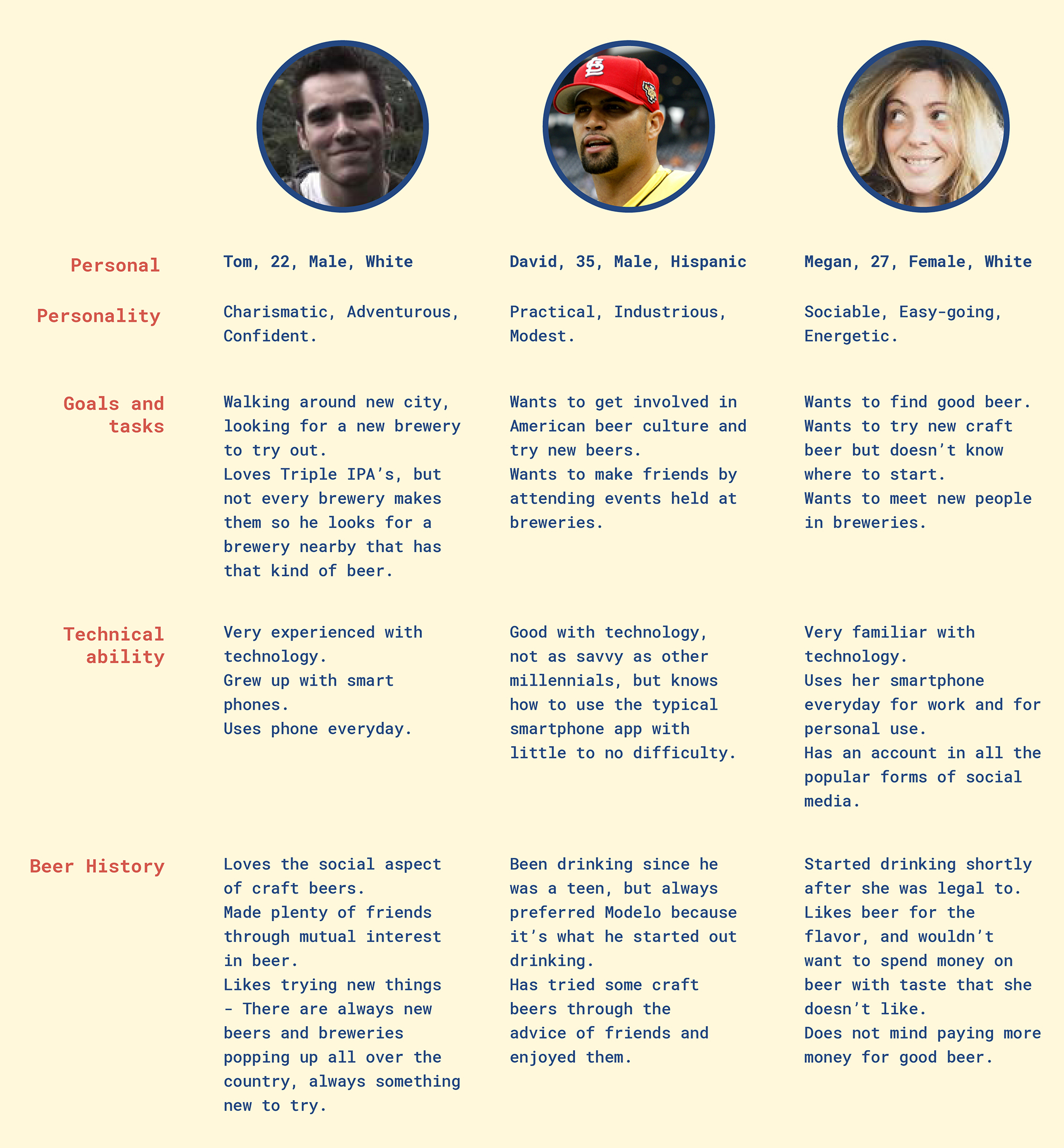
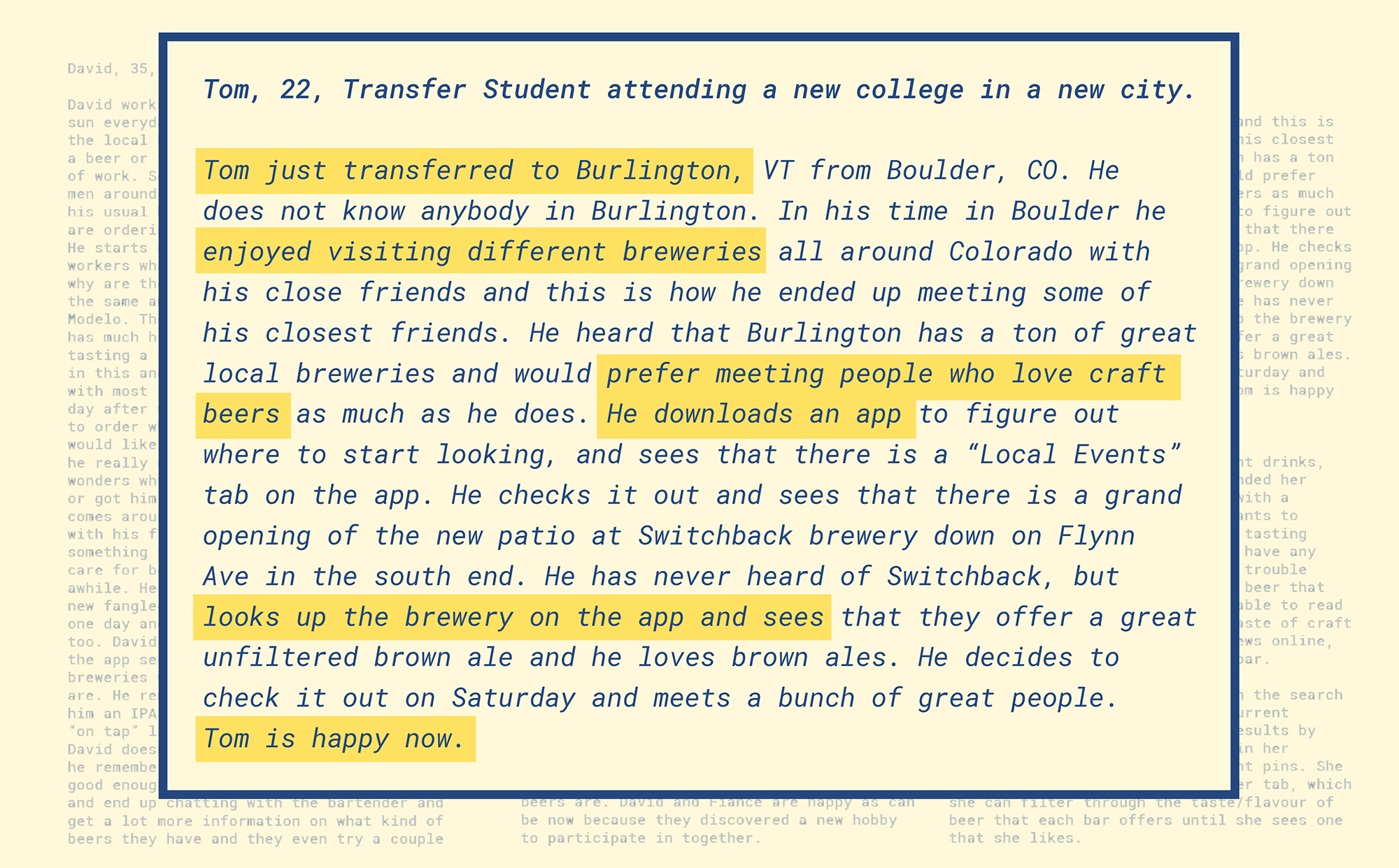
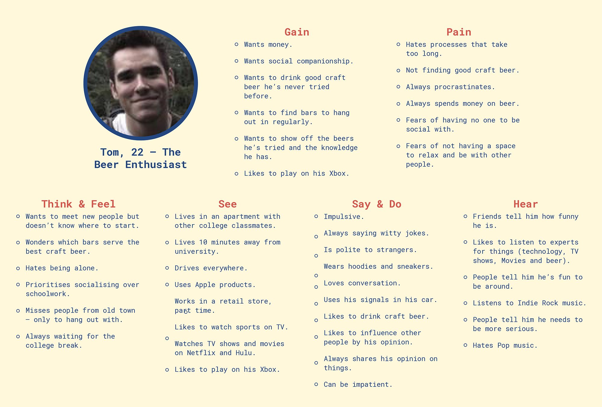
We made up scenarios for our three main personas. The one that we ended up focusing on is Tom:
We initially noted down main goals that a user may have, and what kind of tasks they could complete with this application.
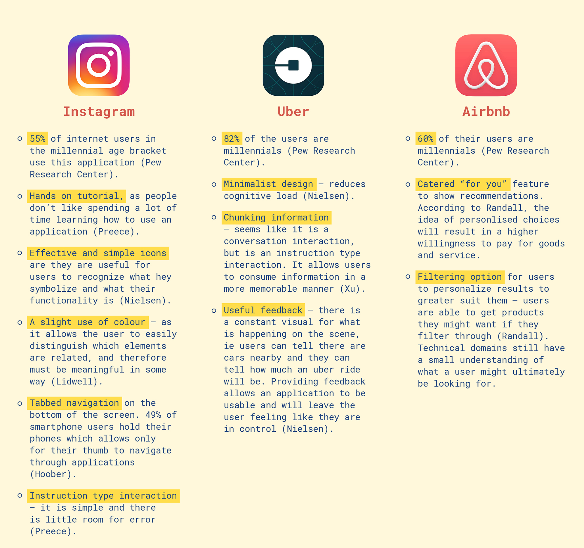
Because most of the craft beer consumers lie in the millennial generation, we wanted to use inspiration from popular current applications that already cater to our target audience. Using the successful aspects of their application design, we based our own designs from their usable interface. Using existing patterns from other applications helped us design our own applications, as users will bring their current mental models and will easily adjust into our own application.
The usability of an application is determined by how efficient it is to use (ie how learnable and memorable it is.) The quicker a user is able to learn how to use an application, the quicker they are able to complete a task. The more memorable the functions of an application are, the quicker the user is able to complete a task.
We looked at a few popular applications that millennials use...
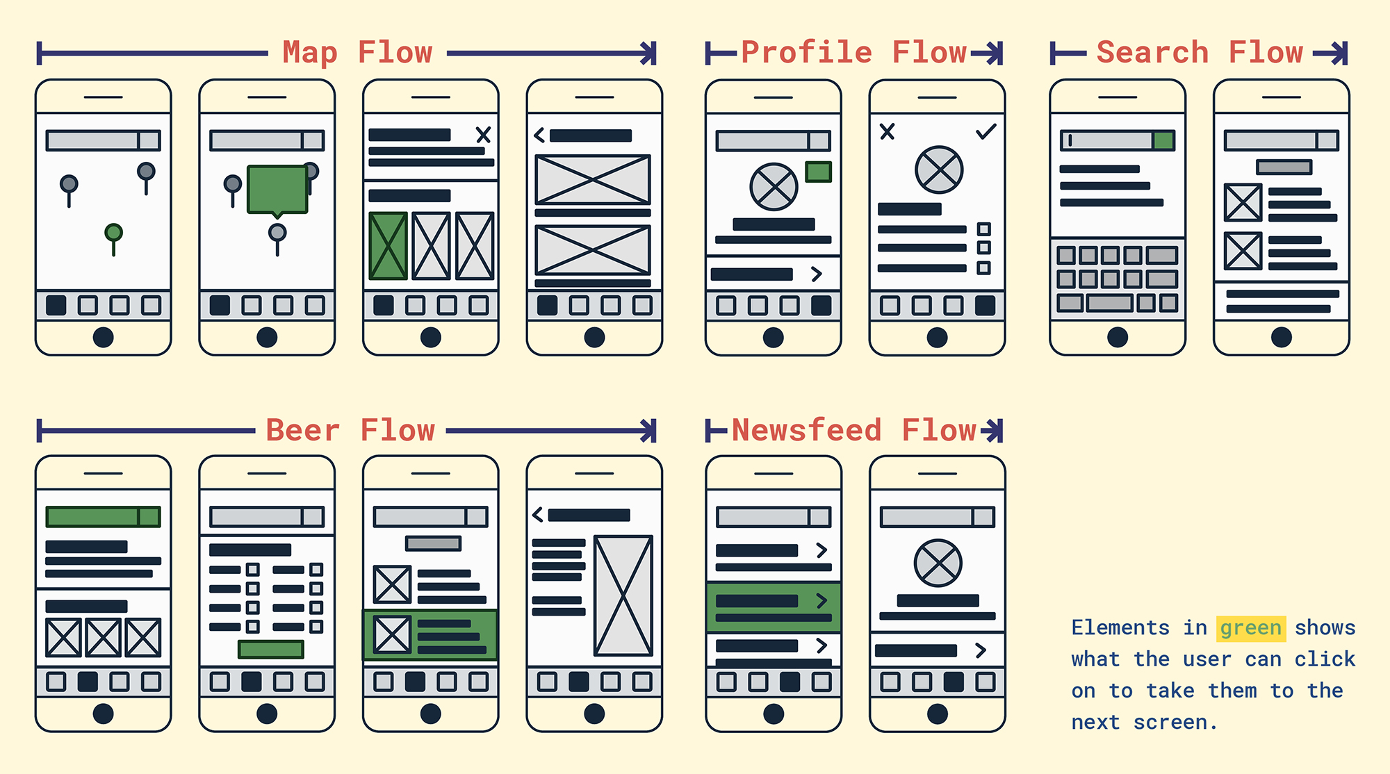
We started to think about what our application would have and what it would look like, and how the pages would flow from one screen to the next. This also helped us lay out the information in a logical manner.
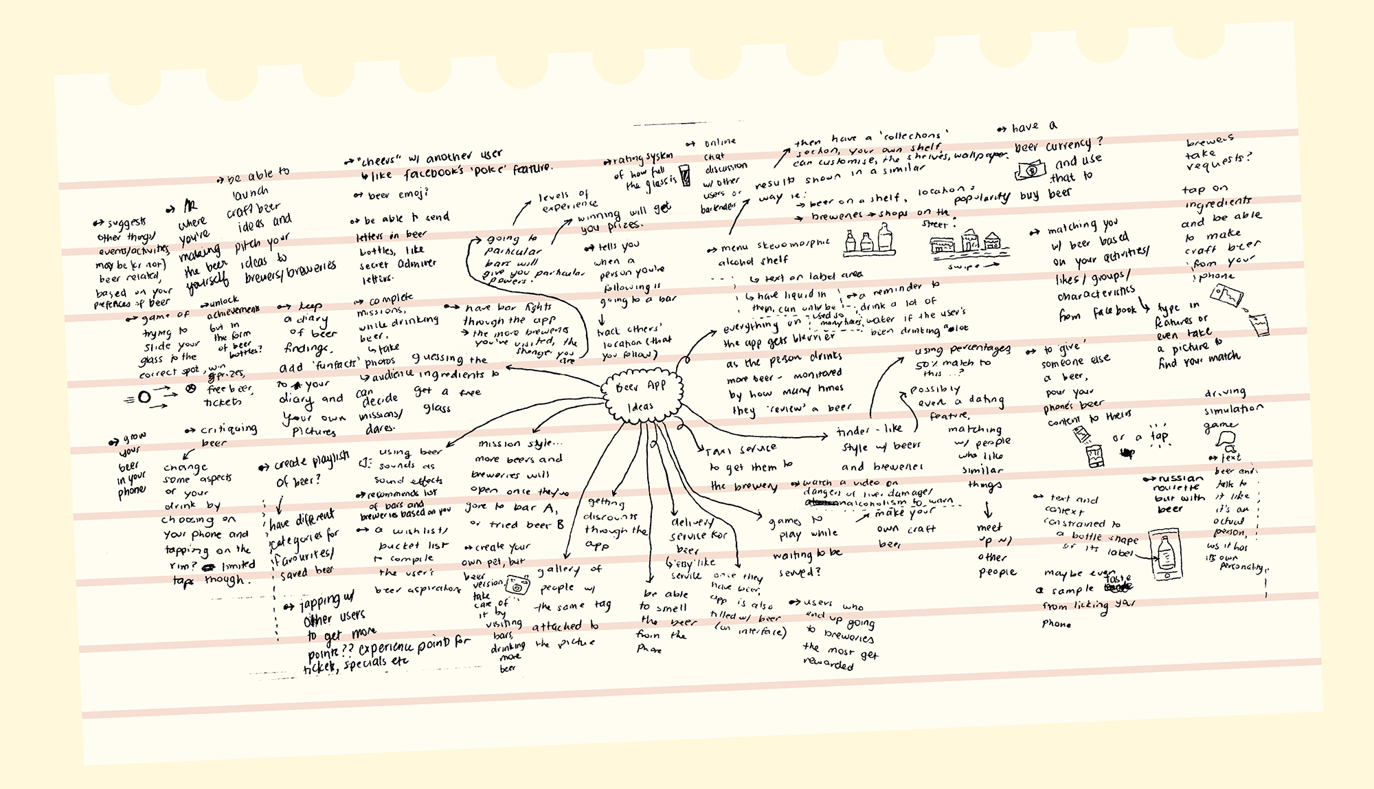
We then brainstormed different ideas and we tried not to be limited by feasible ideas. The point of this brainstorming exercise is for us to expand our horizons and see if there are any epiphanies that come up through this exercise.
We then chose to hone in on one of our stakeholders to better craft an application to cater to them and their needs. We then extended one of our personas so we could have a better understanding of their goals and needs.
Personally, I could not relate to our main stakeholder (Tom – The Beer Enthusiast). So creating an empathy map helped me understand the underlying motives and goals that this user may have.
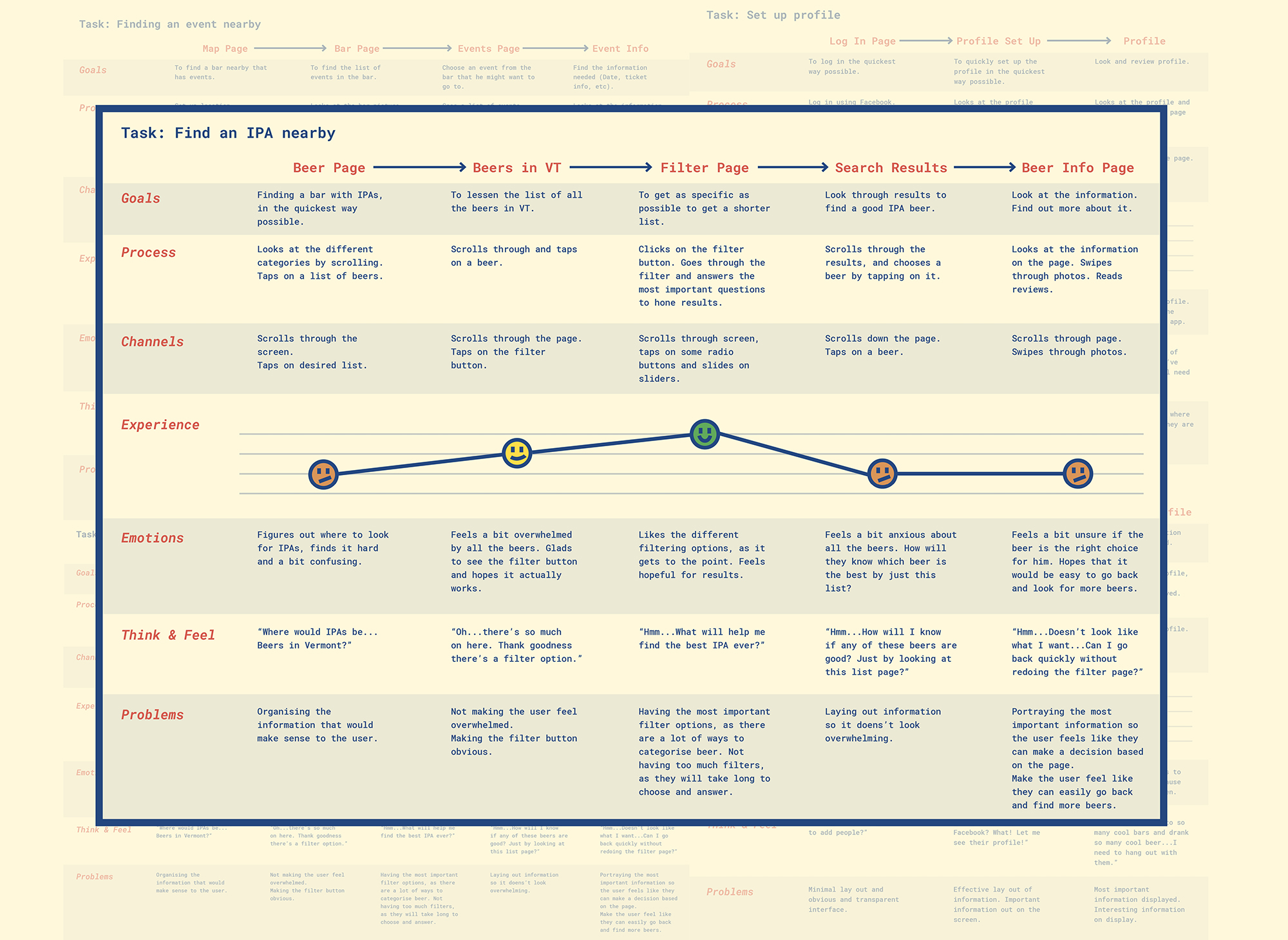
Customer Journey maps help illustrate what a user might think and feel as they are using a product. This helps bridge between a customer's thoughts and the application's interface and software. This helps us figure out what screens we really need and what kind of tasks that could be done on these screens.
We figured out the main tasks that can be done using our app, and made customer journey maps to correspond to those. We based this off "Tom – The Beer Enthusiast."
We then looked at the above applications and the main tasks to come up with the requirements for not only the aesthetic of the application, but its features and what users can do.
In order for our application to be usable, we need to make sure that the conceptual model of our application matches the mental model of our target users.
Interface Metaphors
Interface metaphors allow users to find a connection between our conceptual model and what they are familiar to (Preece). In this application, we have added a search bar (using a magnifying glass icon), which is already a familiar metaphor that our users can easily understand. The map is also based on real life maps - there are directions, roads, and the main thing (or things) the user is looking for. Because our target audience is well versed with technology, it would be unnecessary for us to explicitly explain the different functions that can be completed with some aspects of the app (eg, zooming in and out of the map, and moving the map around on screen.) Using the map as an interface metaphor can help us with structuring our application. We used the typical mapping conventions to help inform us about what kind of information to display on the interface.
Interface Type
The app that we designed is a mobile-based application, and with this, comes with some guidelines and principles which we need to take in account for due to the smaller screen size and the environment that the user might be in while using the application (Preece). For example, making sure that the buttons are big enough for the user to tap to without having difficulty. Another aspect that Preece discusses is the idea that people resort to mobile phones when they need up to date information, and our application provides up to date information about beer to our users.
Communication Type
This application involves a co-presence type of communication. This involves having awareness of what everyone else is doing, and making everyone aware of what you’re doing (Preece). Our application allows users to see their friend’s posts, and also make their own posts. It also keeps track of the beer that the user has tried, and their favorite beer, which they can make public on their profile.
We had a conversation about the main features of the application and what kind of lay out we wanted based on our earlier research.
We then decided on an idea and decided to sketch out wireframes to get a sense of the flow within the application. This helped us realise what kinds of tasks could be completed and what screens we would need to design to help the user complete their task.
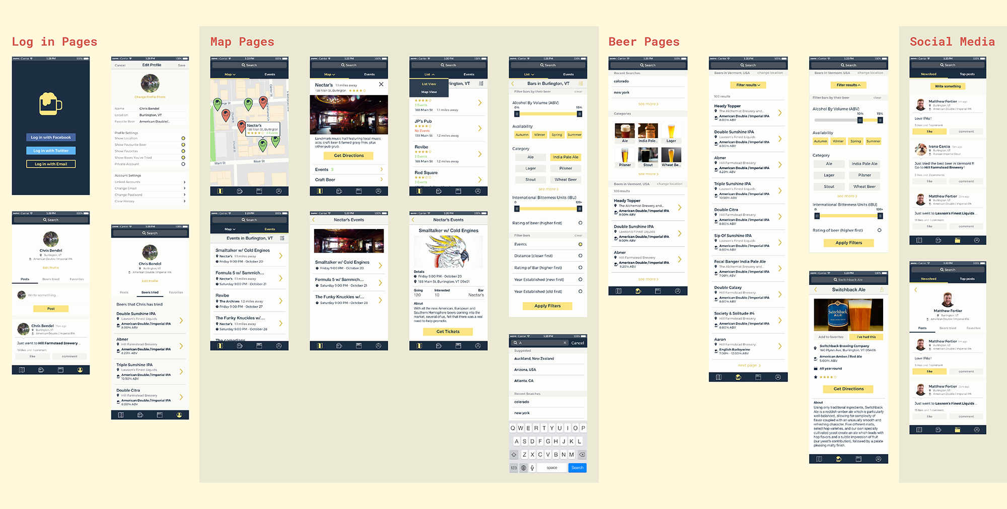
Once we were happy, we went onto Marvel to create our first prototype. Because this project was on a tight schedule, we decided to start right away with designing. Usually designing the aesthetics of an application should come later on (form follows function), however, we wanted to try to get as much done in the time frame we were given. We did use our research on initial applications to help us determine how to design our own application to cater to our millennial target user group.
According to Zabed Ahmed, Heuristic testing can show problems in an application in a short amount of time, but it requires revisions from expert users, not the typical target user. Lingaard proposes that improving an application through user testing can also improve it. Other things such as observation and interviews can also help with improving an application’s development, which won’t necessarily be seen through user testing or even heuristic evaluations. Because of this, we proposed that doing a heuristic evaluation for our own application will get rid of the main and obvious errors, and after completing that, we can get real users to test our products to fine tune what to improve upon.
We came up with our own set of heuristics, which were based from Nielsen’s and Gomez’:
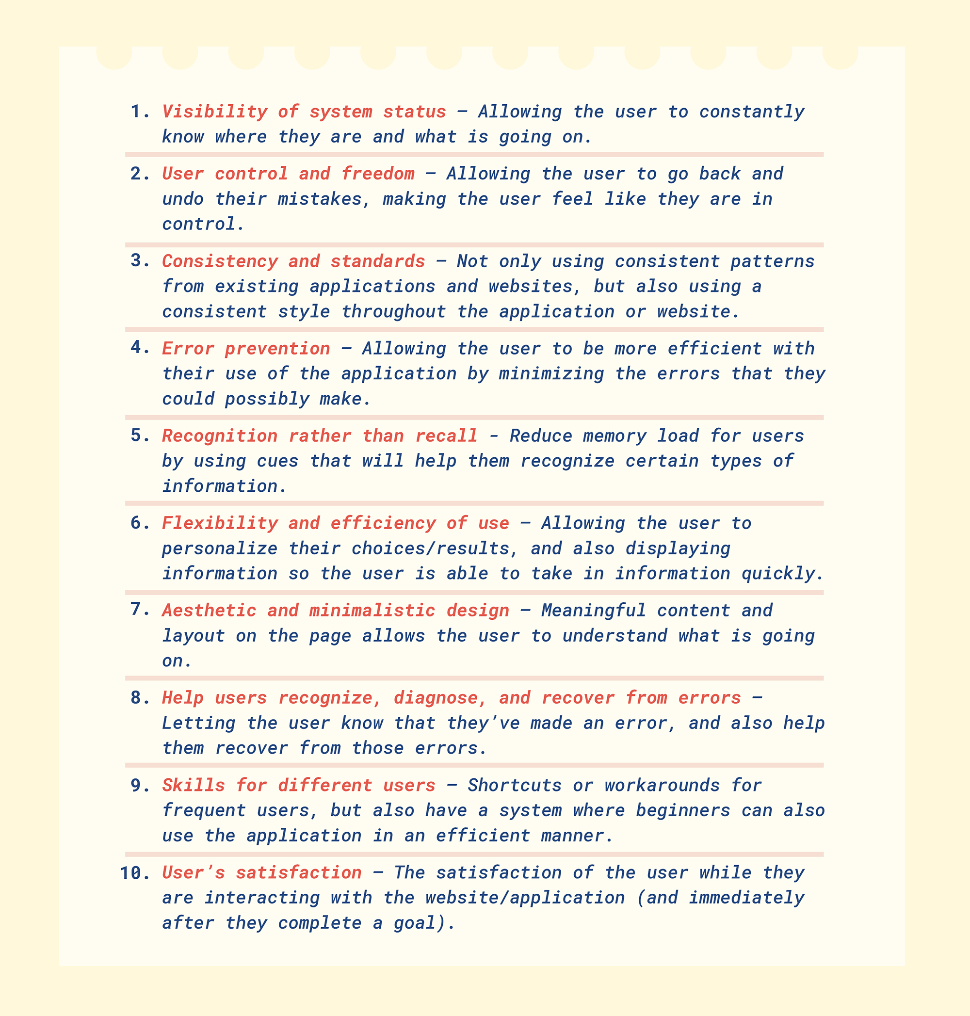
Evaluating our application based on the above can keep our mind fixated on a user-centred design. It can help inform us on what decisions to make, in terms of designing the layout of information and elements on the screen.
Goals of the study:
To find areas where improvement is needed by having the user go do different tasks which takes them through the different features of the application.
Format and setting of the study:
Done in the classroom, and in person, using the computer. The interaction feels more personable, and we were able to detect subtle cues (like body language, facial expressions etc).
Number of users:
Since there were only 8 other people in the classroom, (not including the professor or the members of our group) we aimed to test that number of participants. Nielsen even states that 5 users is enough for a suitable user testing session.
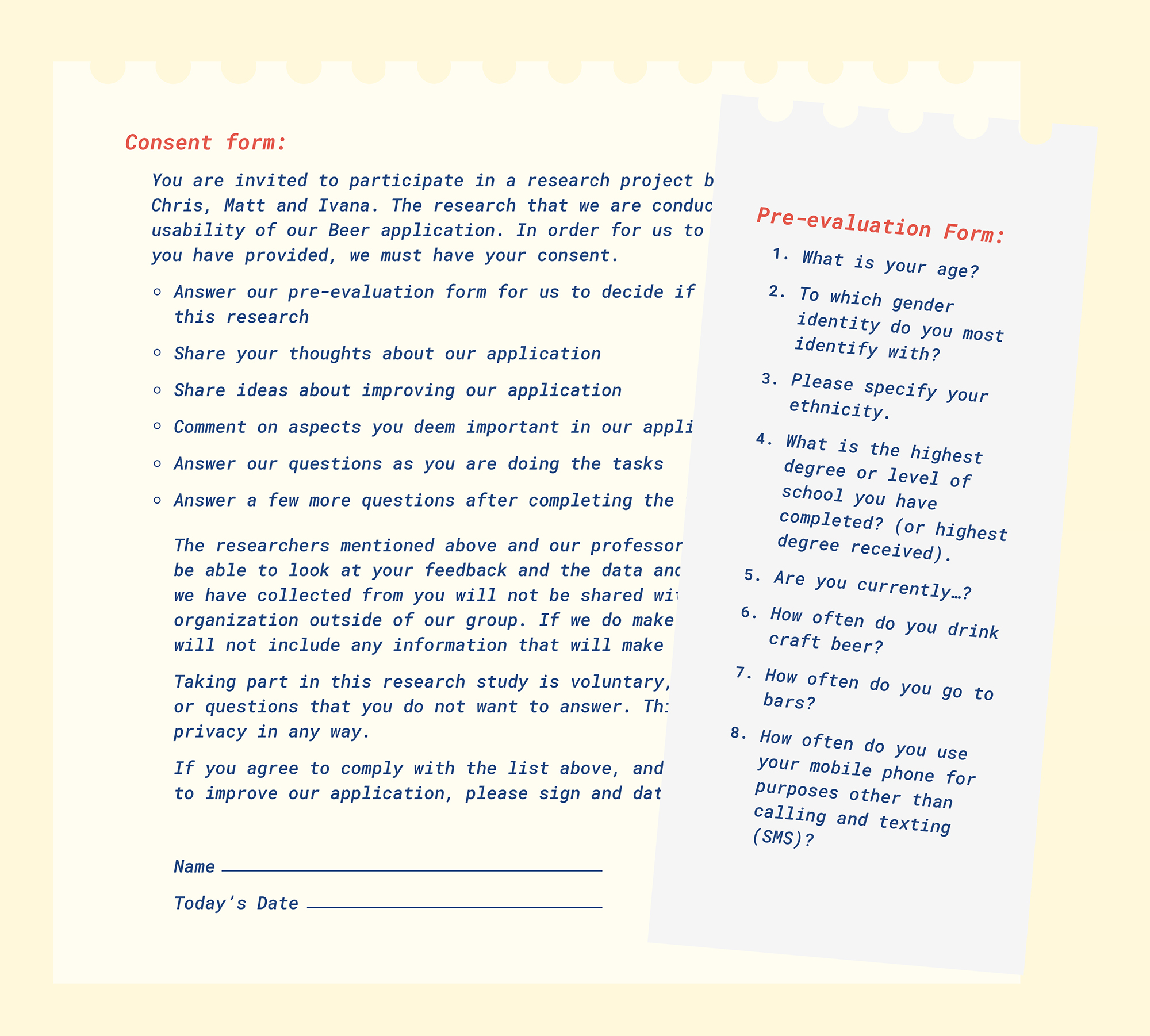
Recruiting suitable participants:
In order to test the suitability of the people in our classroom, we had them do a Pre-evaluation form. The form tested for demographics (such as age, education and ethnicity) and their beer drinking habits, and their mobile phone usage. We also had them do a consent form to give us permission to use their data.
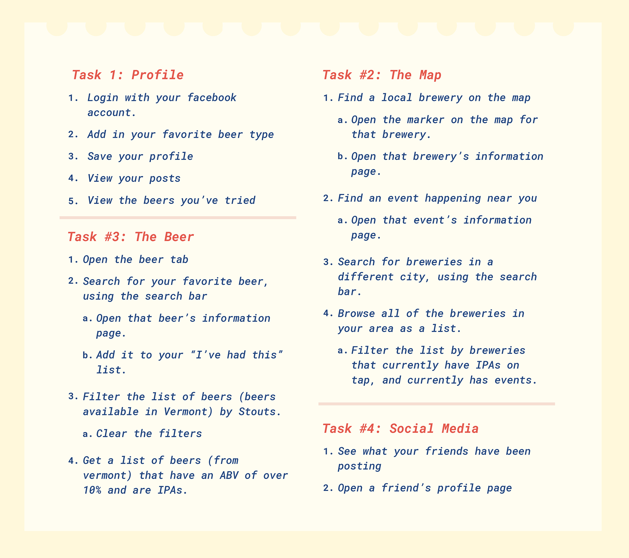
Tasks and Questions:
We planned to give users specific tasks that will test the usability for the different features of our app (such as find your favorite beer, look for an event, etc). We plan to ask open ended questions such as “how are you finding this feature?” to prompt the participants to speak their mind while going through the application.
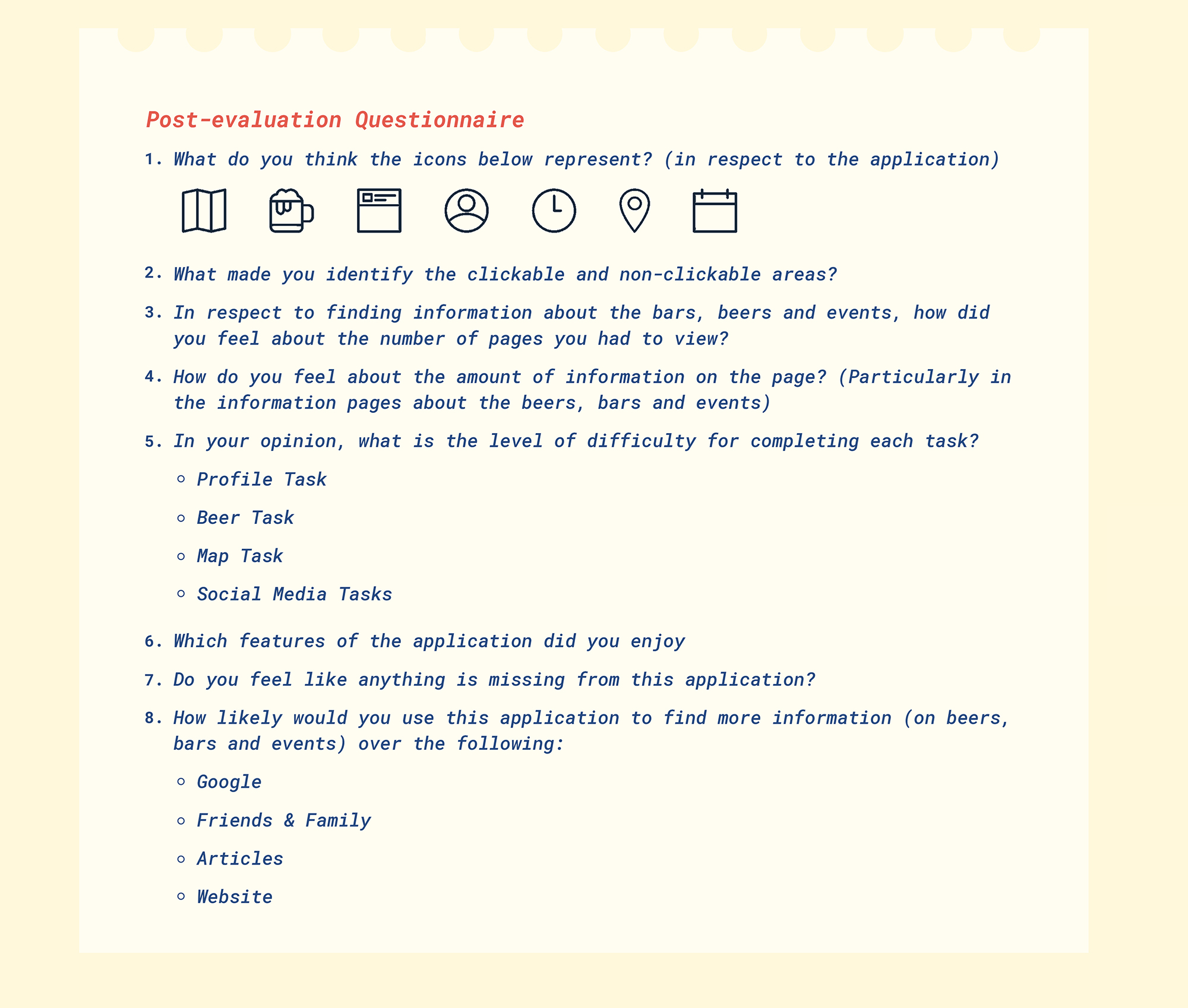
Metrics:
After the user completed the tasks, they completed a post-evaluation form that asked them about their experience and thoughts on the application. Our first post-evaluation form looked for some more broader opinions, as we wanted to know what to improve on next.
On the day (November 3 2017) we set up our application’s prototype on one computer and we had a separate computer set up for the forms and the pre and post-evaluation form. We found that our test was longer than all the other groups, and instead of giving every participant the same test, we gave them different tasks (so by the end of the class, we got information on different tasks and features of our application). Due to the time constraint, we weren’t able to ask open-ended questions as much as we’d like. We weren’t as consistent as we planned due to different people carrying out the tests and observing the participants.
Demographics:
The people in our class didn’t go to bars or drank craft beer, but they were millennials and were smart phone users. We tested the usability of our application on them, as we assumed that they would have an understanding of how to use other popular applications and use their current mental model to use our application.
Good Feedback:
The icons that we designed were well received, with everyone understanding what the icons meant. We also had good feedback from some of our tasks:
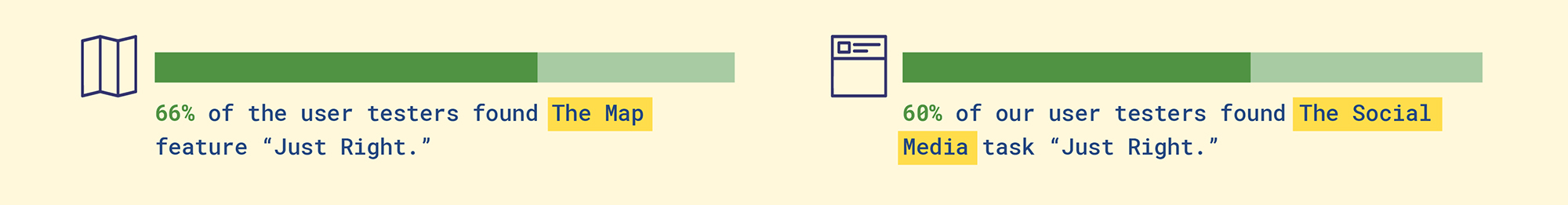
Because of the good reception, we decided to focus on the other aspects of our application…
What to improve:
From our observations there were some features of the application that caused some confusion over the others. Our post-evaluation form also showed these results to back up what we saw:
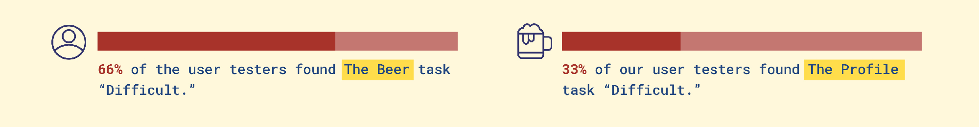
We decided to focus on these two features/tasks in our application to improve upon. We then researched ways to improve our application.
Profile Task:
Problem:
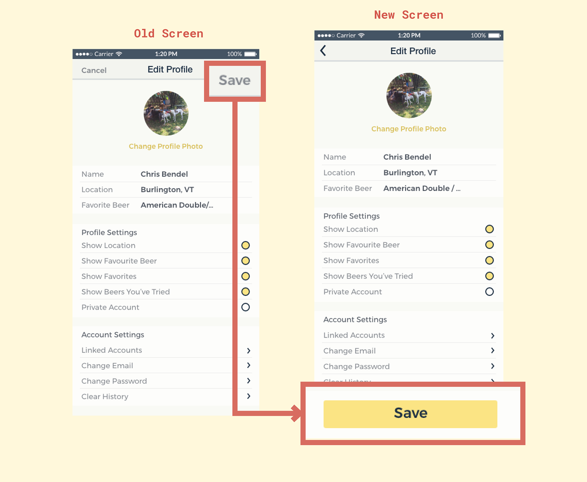
From our observations, the users had trouble with finding the main call-to-action “save” button when they were finished with editing their profile.
Changes:
To improve our design, we planned to redesign this button to be more obvious. Moving the button to the bottom to allow comfortability and designing it in such a way to attract attention, will encourage the user to move forward (Nodder).
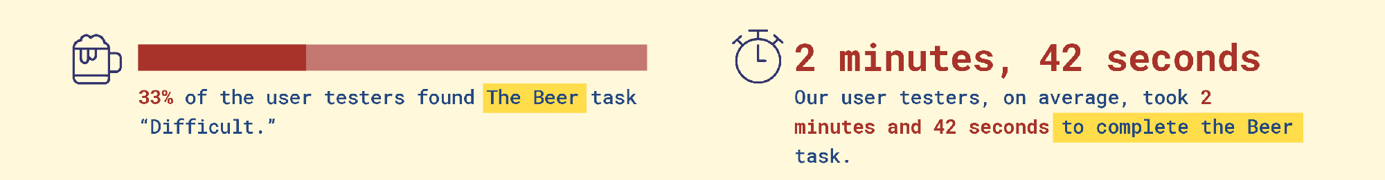
Beer Task:
Problem:
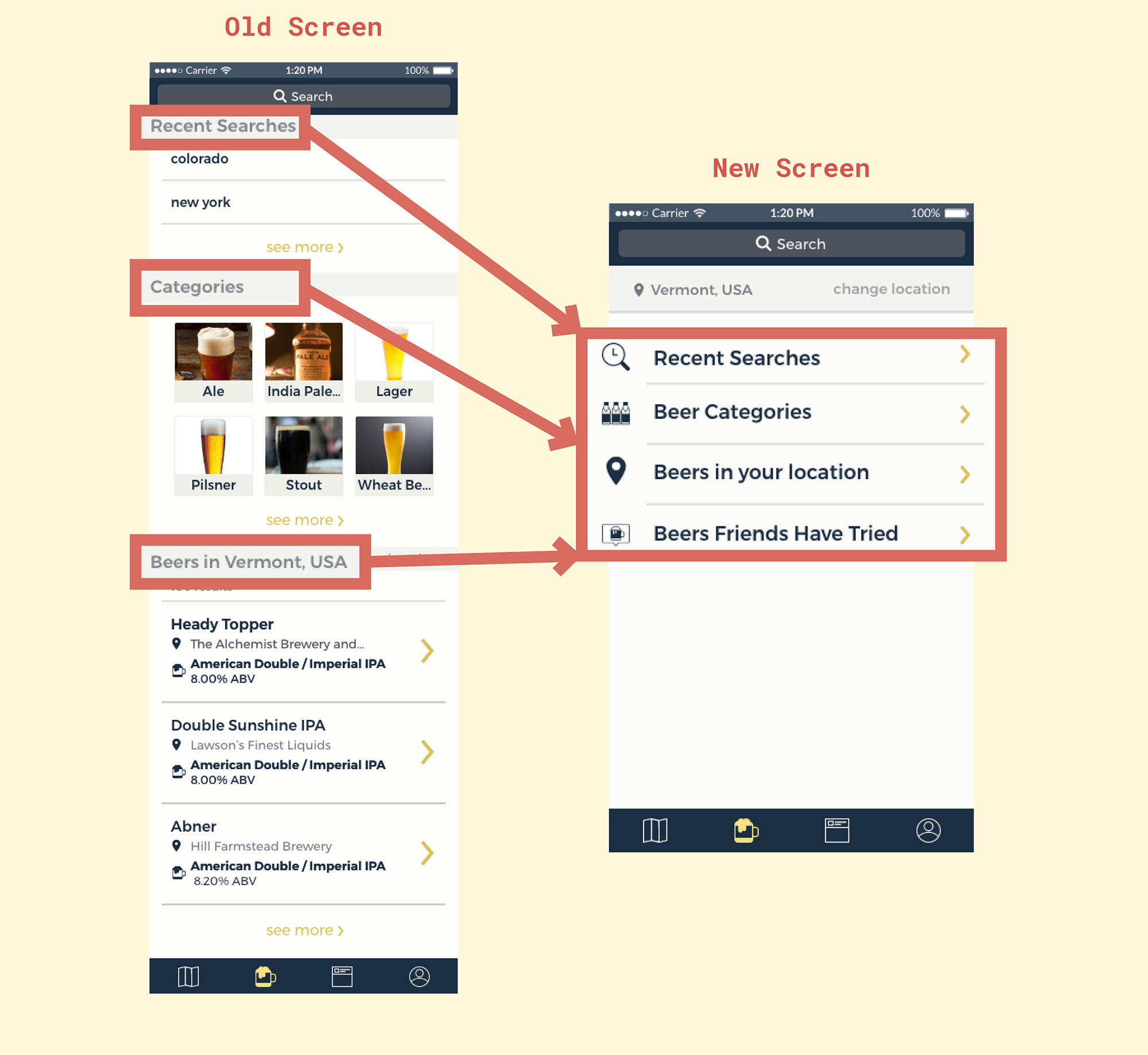
The users took time with completing the tasks because they found that the amount of information on the page was too much. They also were lost a few times, unsure of where things were.
Changes:
Chunking information into their own pages to be more logical, and to be more memorable for the user, as it also reduces memory load, so the user will not be overwhelmed with what is on the screen (Lidwell).
Using Hick’s law helped us narrow down the amount of information shown on the page. Hick’s Law, simply, discusses how the time it takes for a user to complete a task increases with the number of available options or stimuli (Nikolov).
According to Soegaard, the landing page is the first glimpse the user will see, and with our app, the main beer page acts as the landing page for that particular feature, and it is “particularly important to minimize the choices on there.” There are ways to do this, like categorizing choice (much like chunking) where we categorize lists logically (Soegaard) and presenting it in such a way that won’t look cluttered.
According to Nielsen, having user control and freedom in an interface is a principle for interaction design. We chose to implement an ‘Are you sure?’ dialog for the user to check if they really wish to clear the filters. Sometimes, users make mistakes, and will need a clearly marked “emergency exit” to go back to their previous state (Nielsen).
Designed Changes:
Profile Task:
We primarily changed the aesthetic and location of the ‘save’ button, in hopes to attract the user and therefore move on quickly to complete their task in a timely manner. We hoped that the design change is enough for the participant to know what to do next (which is to tap on the save button), and where to look to complete the task of saving the changes made on their profile.
We planned to test this task again and we planned to also observe the user, watching their actions and listening to what they say, to get an idea of what their thoughts are. We planned to also ask the participants for their opinions on the task (using the post-evaluation test), and we timed the users with how long they complete this task:
Beer Task:
We primarily grouped the different categories into their own lists, and the user is able to tap on different lists, which will take them to separate pages full of results, which they can then filter through, using the filtering feature.
In chunking the categories into separate pages, we hope that the user does not feel overwhelmed or lost with the amount of information on the page, and therefore, will be able to carry on with their tasks. To get an idea of what their thoughts are, we planned to listen to what they say vocally, and what they do while interacting with the interface. We planned to ask them for their opinions on the interface using an updated post-evaluation form.
We also wanted to test the usability of the filter feature, in terms of its on and off states for some buttons. Our filtering feature, by default, has the states ON for the availability, and we planned to ask the user to find a beer that is available all year round, using the search feature. We planned to observe what they do, and ask them for their thoughts. We planned to also ask the user how they know which states are on and which are off in the post-evaluation test.
Because of the changes to our tests, we needed to change the content of our post-evaluation form to ask for more specific things to do with the tasks outlined above. There were more specific questions that asked about the way things look, and the way things are laid out.
Goals of the study:
We wanted to see if the changes we have made to our application made any difference in the time (and difficulty level) for users when they complete different tasks. We hoped to find an improvement (ie shorter time to complete tasks and lower difficulty levels).
Format and setting of the study:
Because we were all in different places during the testing time period (Thanksgiving), we tried to test in different places/settings and environments. We hoped that it emulated the different kinds of environment that we want our target users to use our (finished) application in (bars/public spaces/etc).
We used our laptops for the user to test our prototype in (due to some limitations with the Marvel Application on mobile.) We also be conducted these tests in person, as the interaction feels more personable, and we were able to detect subtle cues such as body language or facial expressions.
We also had tested some users over the internet. We used Skype to share screens, so we could see what the user was doing, and we had the microphone and camera set up so we could hear and see them too.
Number of users:
Because of the time limitation of the holidays, we aimed to test six users especially because this was what was required. Nielsen suggests that five is enough to test with.
Recruiting suitable participants:
Much like the first test, we had a pre-evaluation form to test the suitability of our users for valid results. We had them complete a consent form to allow us to take their data and information to improve our application.
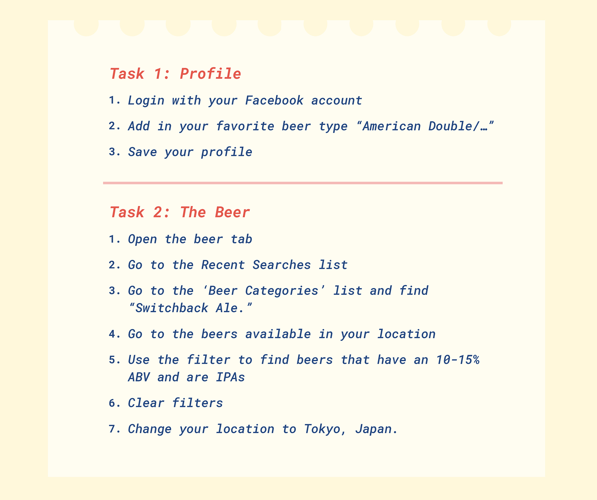
Tasks and Questions:
From our first prototype and our first evaluation, we found that users found two tasks more challenging than the rest. We chose to focus on these tasks to improve upon, and therefore test new users on. The tasks that we asked users to do were similar to the first prototype lab (especially for the profile task, since we didn’t do many changes – we just wanted to test if the time taken to complete this task would be significantly lessen).
However, for the beer task, we did change quite a bit, so the tasks we got the user to complete were catered to the changes. We planned to ask open ended questions such as “how are you finding this feature?” to prompt the participants to speak their mind while going through the application.
Metrics:
After each user completed the tasks, they completed a post-evaluation form that asked them about their experience and thoughts on the application. We also timed how long they took to complete the tasks.
We had changed our form, since our first post-questionnaire had questions about the different features of the application, and other things like the design of the icons. We got rid of some of those questions because a) we didn’t want our users to be frustrated due to the endless questions and b) the users from the first prototype lab responded well to the icons designed.
During the Thanksgiving break, we set up the application’s prototype on our laptops, and also had the forms ready in separate tabs. We asked different users in different environments (hotel bars, the internet, our rooms, etc) to test our application by attempting to do the tasks we set out for them to do, and answer the questions we had asked them (verbally and on the forms.)
Because of the time constraint of some of the users, we could not time them, so only approximate times are noted. Due to us (Chris, Matt and Ivana) being in different locations, we cannot guarantee that we were consistent, and asked the exact same open-ended questions while the users test our applications.
Demographics:
We found that our users go to bars and drink beer more often than the first group. Most of the second group of users use their phone a substantial amount of hours per day, which falls in line with our main target audience (of being a proficient technology/smartphone user). This was be beneficial, as a lot of our design is based on current mobile applications. If they are familiar with the more popular mobile applications in the market, hopefully, they will be able to take their mental models and use our application comfortably.
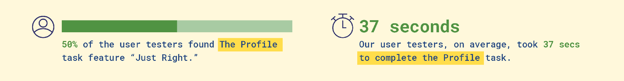
Good Feedback:
The user testers didn't take long to do the profile task (seeing as there were only a few things to do.) This was good news, as it helps us understand that there is a vast improvement from last time. We also found that, with our profile task that...
From the observations, some people had trouble with understanding the concept of a prototype, especially one that meant to be mobile, but done on the computer, and it seemed like it was a hindrance to their performance with this task.
What to improve:
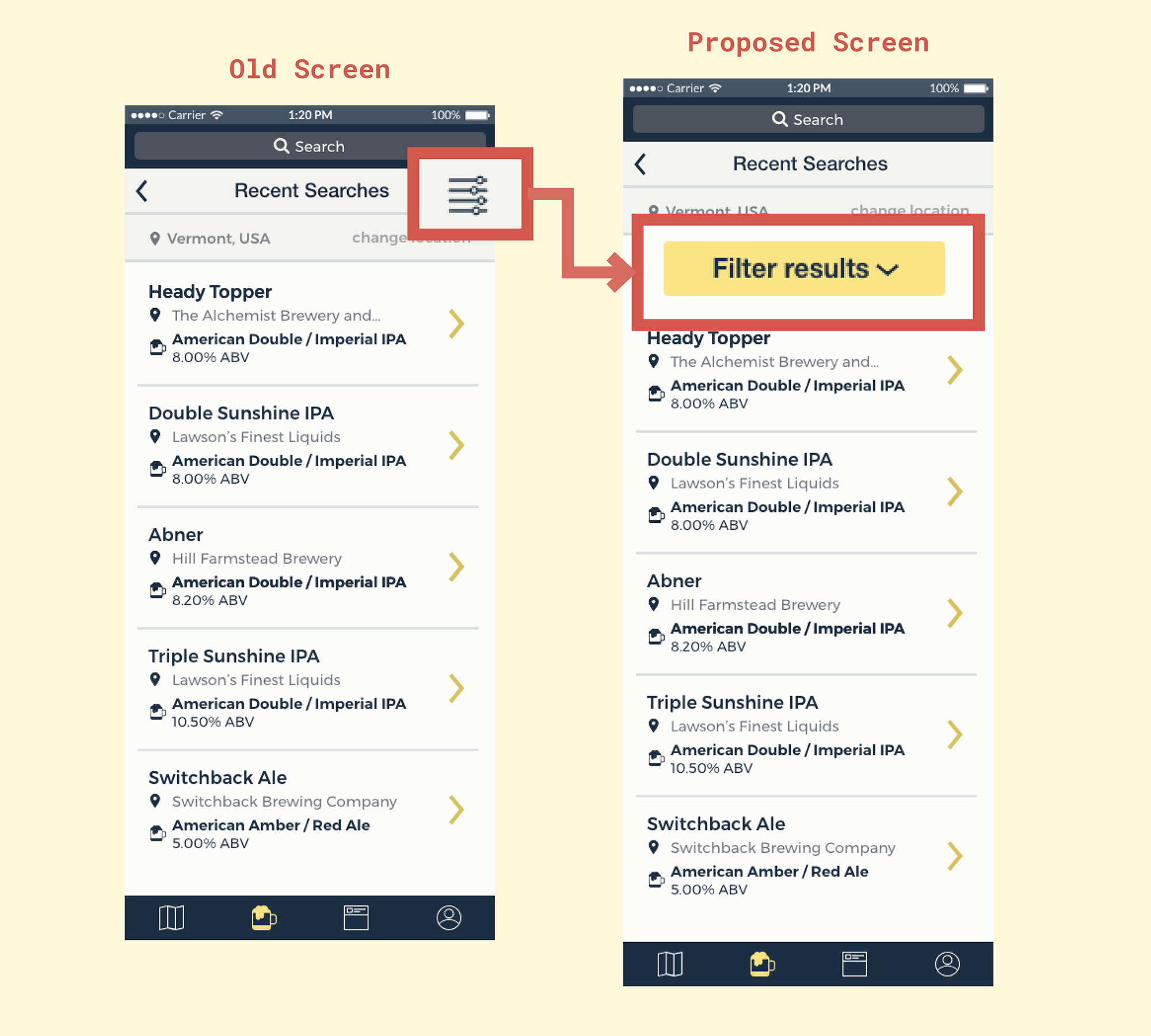
Our user testers found the task difficult, mainly due to trying to find the filter feature of this application:
The time was significantly longer because there were more tasks involved with this main task. We also noted how people had a hard time with looking for the filter feature.
Beer Task:
Problem:
From observations, the users had trouble with finding one of the most important features of the application, which was the filtering feature.
Changes:
Make the filter feature more prominent in the application.
Proposed Changes:
Beer Task:
Using our past research, we decided to make the filtering feature more obvious to help the user move along the interface in a quick manner. We haven't yet finalised what exactly we plan to do, but this is a rough look of the proposed change:
Satisfaction:
Another important aspect of usable interfaces is how satisfied a user feels when they are using an application. In our post-evaluation survey, we asked what the users would rather use compared to our application:
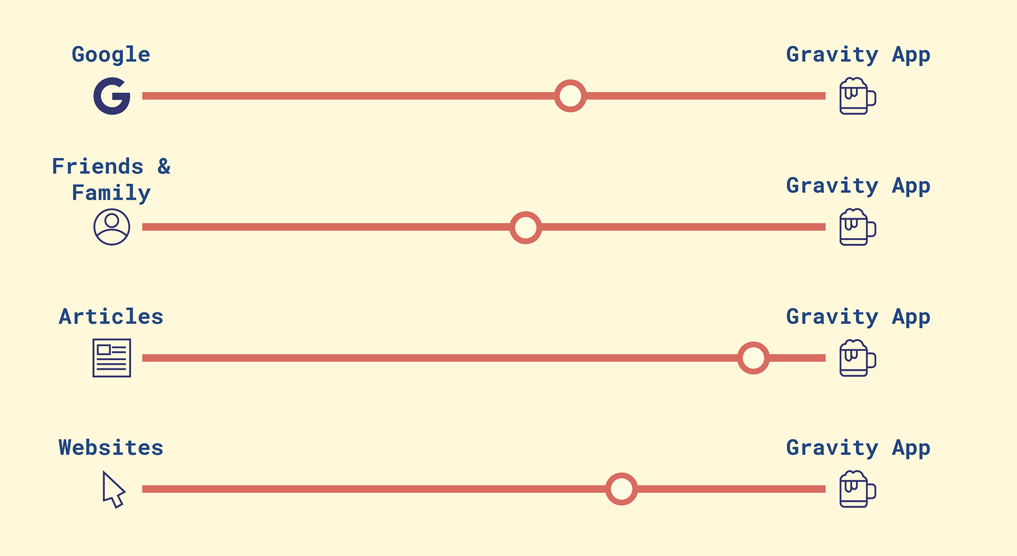
There were some users that were vocal when answering the forms, and overall, we had good and positive feedback. We can see that a lot of our users still prefer to go to their friends and family for their opinions on beers and bars. Our application lacks conversation, and perhaps this is what people want when they go to other people for their opinion on alcohol and places.
There will always be improvements to be made to everything, and this is certainly the case with our application. We have done user testing, and I’m sure that we could always go through more testing to further develop our application. For future changes, we definitely would try to develop our two other features (the map and the social media feature), and do a heuristic test on those, and even get users to test those.
Click here to try the prototype!
Below are little videos to show a walkthrough of the app with tasks.
Special thanks to my team mates Chris and Matt, and our professor, Sarah.