| about | works | resume | contact |
"Happy Trails" helps dog owners find walks suitable for their needs and their dogs. The app can also help them plan ahead, to prepare for weather, the route and seeing other dogs.
Bryoni and I formed a team to design our app. Throughout the month and a half, we ideated, designed and prototyped our application. The central theme for the apps was “transport,” so we had to create an app that somehow made use of that word.
We started off with brainstorming anything and everything about transport for about 4 minutes. Once we were done with that, we categorised our little post-it notes into different categories.
We settled on “walking dogs,” which we are pretty excited about. We are both dog owners, and we thought about the lack of apps displaying information about dog walks around the areas we live in.
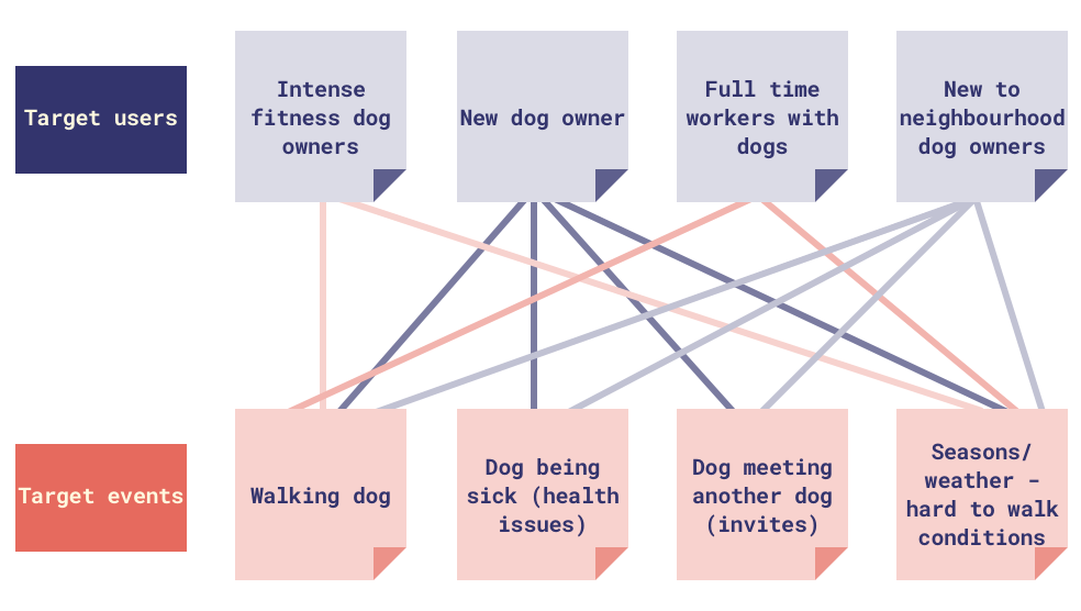
After we both were happy with focusing on a dog walking app, we looked at the possible target users. We then started off our target users and events brainstorm, listing down anything we could think of. We chose four from each, which we thought had the most potential to use an app, and drew lines to connect them to target events. I thought that that would help us with choosing an event and a user.
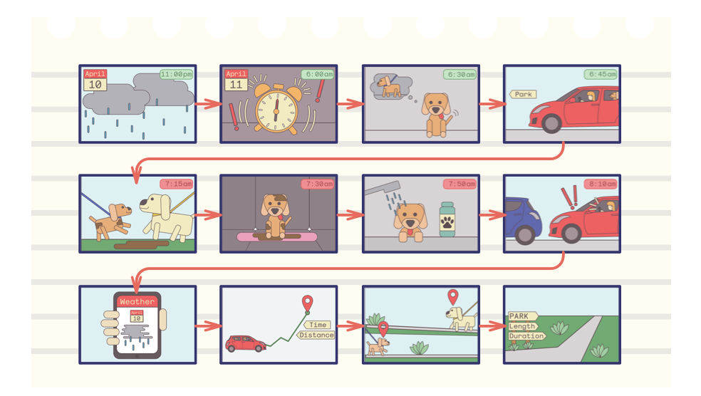
Once we chose our target user and target event (full time workers/walking dog in the morning) we thought of a story.
Our main idea was that, a working person tries to fit in time to walk her dog, but ends up with all these little things that take time (her dog meeting another dog, getting dirty, etc), which results in her being late for work.
Solution: an app to help minimise those little things that take time, and hopefully she’ll have time to walk her dog and get to work on time.
We looked at websites that store walking routes for dog owners. Most of what we found was not user generated, and was not customisable for the users.
For mobile apps, we found that there isn’t really an application with user generated content on dog walking/dog routes specifically, and we could work on that with our project.
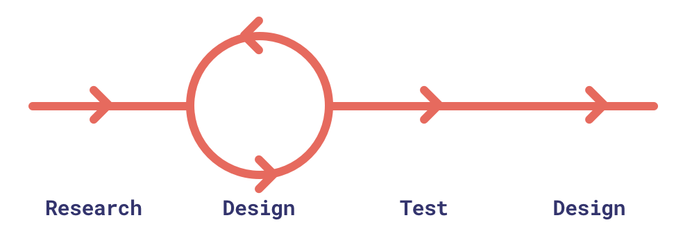
Bryoni and I focused more on the design of the application – its structure and UI. However, looking back at our project, it did have some sort of iterative development:
The main stages of the process were: research, design, test.
Instead of recounting the whole process, I chose to highlight some of the milestones that accelerated the development of the app.
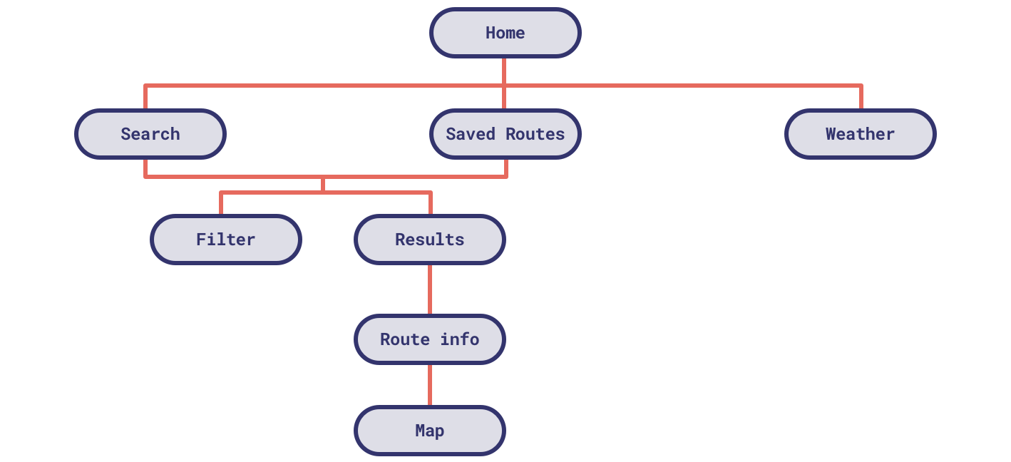
Bryoni and I started off by listing some aspects we’d like present in the app. Bryoni and I then started with our diagram, thinking of the main flows for our application.
We first had three main ideas: Searching for a route, saving routes, looking at the weather forecast
Bryoni and I started off by listing some aspects we’d like present in the app. Bryoni and I then started with our diagram, thinking of the main flows for our application.
We first had three main ideas: Searching for a route, saving routes, looking at the weather forecast
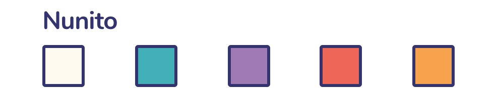
We wanted to have a modern looking design system. We wanted something that sounded optimistic but not too energetic. The rounded icons were informed by the rounded san-serif type.
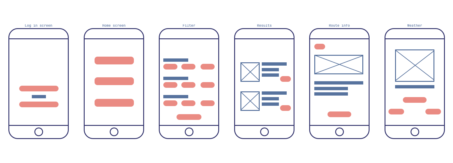
From the wireframes, and deciding the main flows, we designed the UI. We looked at existing UI to get the inspiration for how to deal with buttons, forms and layout. To summarise, we colour coded the app based on their main task.
We decided to NOT have the weather section accessible from the home page. We thought it would be better situated within the actual routes.
The main takeaway for us, were to not only design a user-centred application, but to also design a dog-centred application. A way for us to implement this is to think about what dogs like to do, and their favourite things.
By using Invision, we had quite a big issue with its lack of scrolling features – meaning that there wasn’t an anchor feature available. We had to redesign the way our forms was made. The positive to this was that the size of our form was condensed quite significantly.
We had tested this application by giving close ended tasks, but also asking the participants to follow a think out loud method. All in all, the flow was easy to follow.
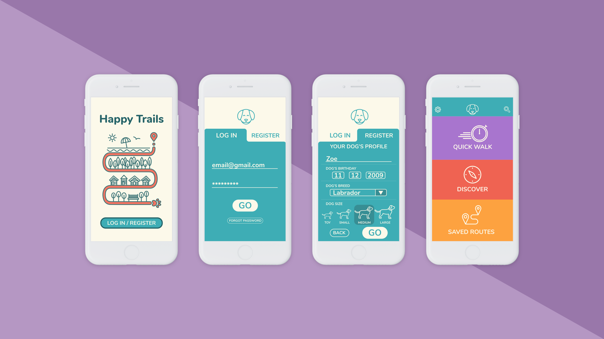
Starting pages and Home page:
The home screen only has three buttons for quick use.
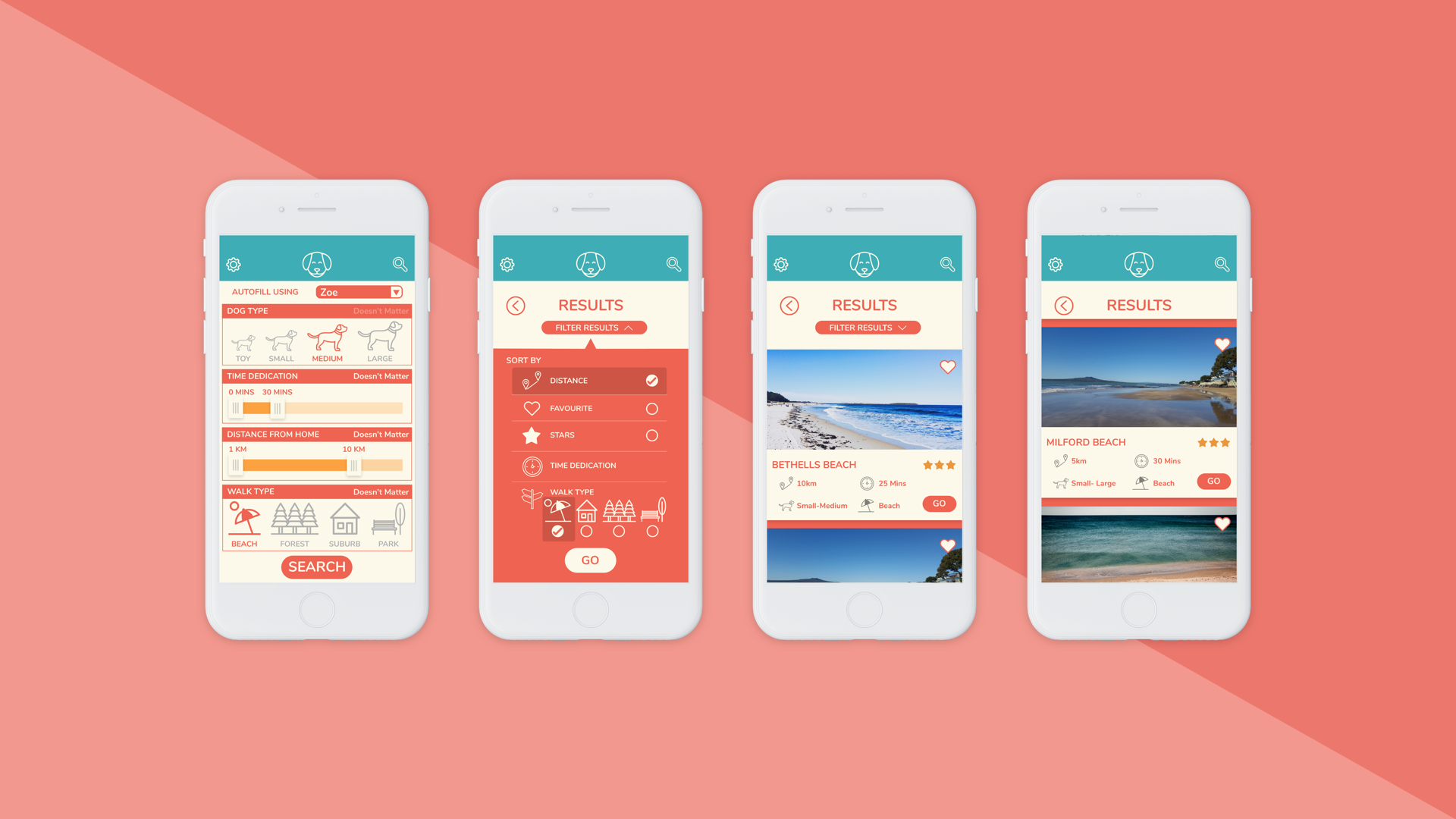
Discover Routes:
Here is where users can discover routes by using filters.
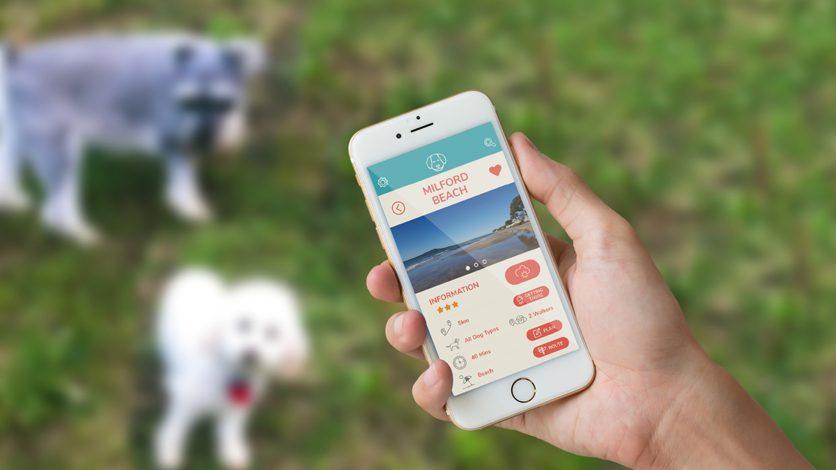
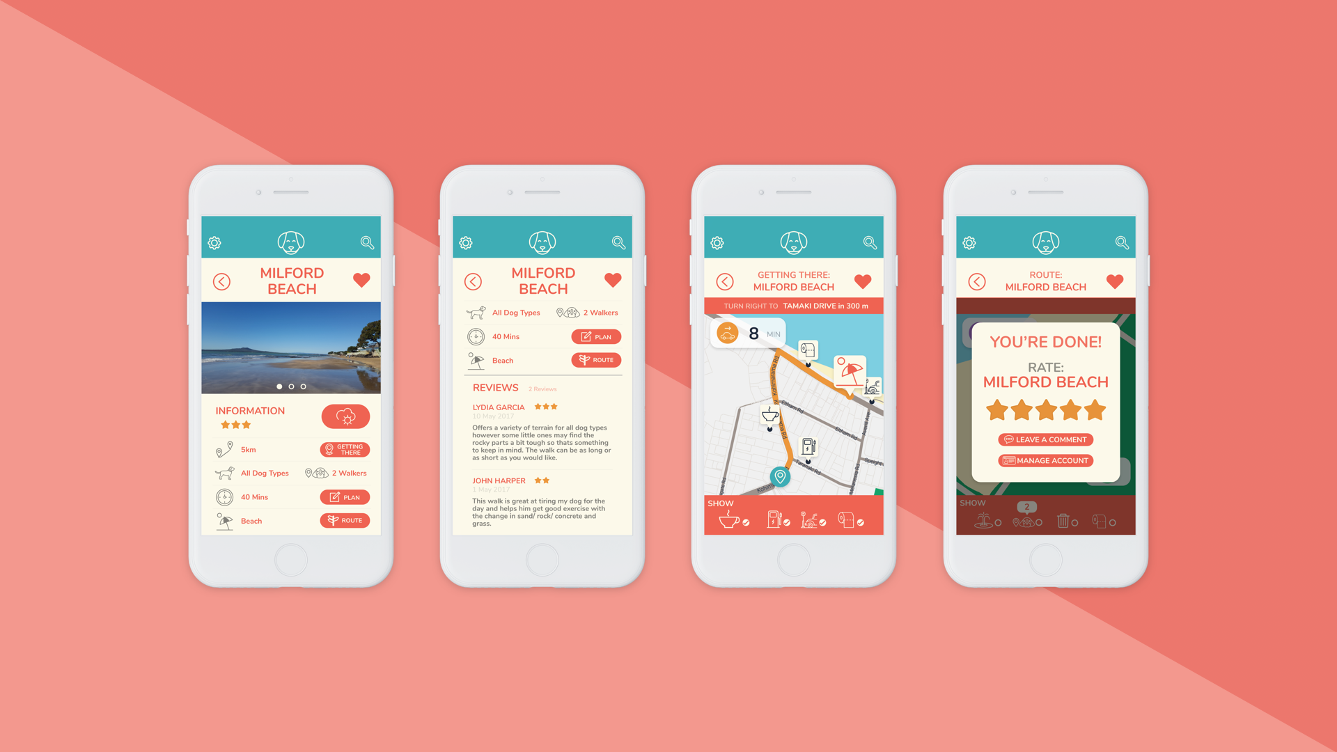
Route info:
Users can find out more about the routes by tapping on the card. They can also get the directions and the reviews.
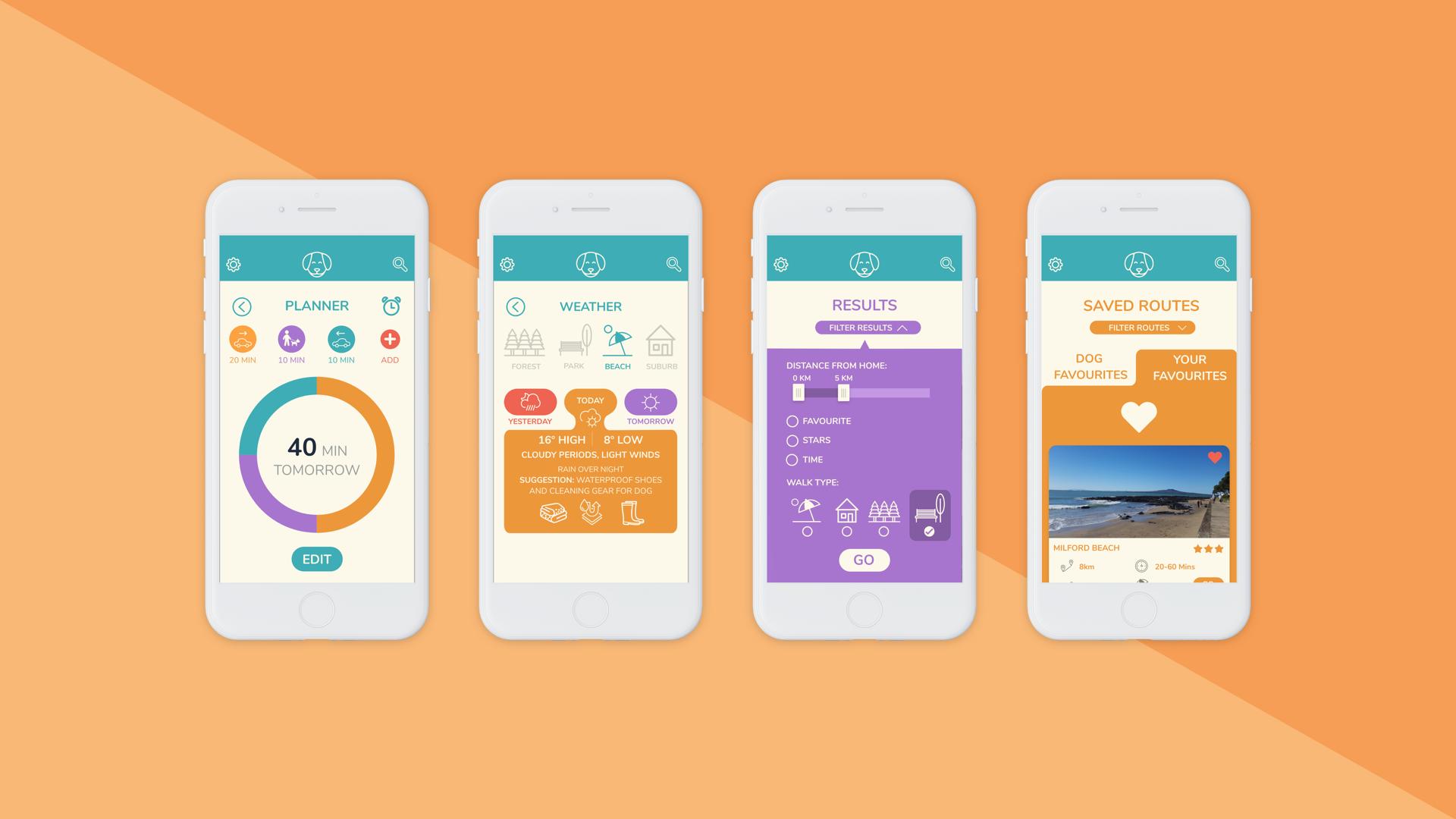
Planning and weather:
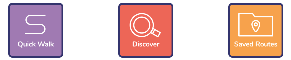
Users can set up their own planners if they desire to do other things before or after walking their dog. Here is also the weather tab for the forecast and recommended layers of clothing. Quick routes is in purple, and it is a shortcut way of finding routes. Saved routes is a folder full of the user's and their dog's favourites.
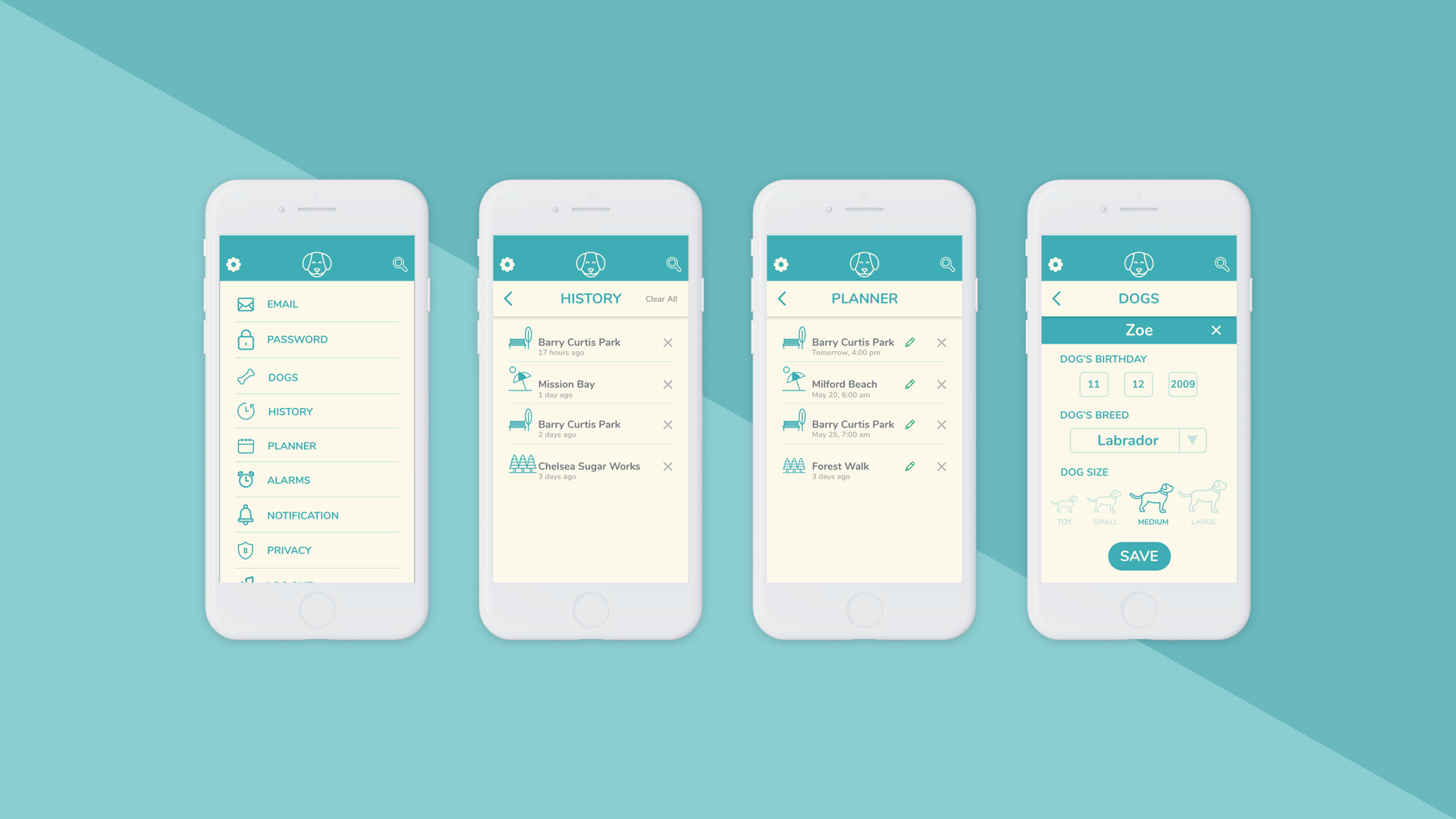
Settings:
Users can see their history, their plans and their dogs in the settings, amongst other things.
Here is the link to the full workbook with all mine and Bryoni's thoughts!
It has detailed accounts of the whole process.
TThis was the first app I’ve ever made, and it mainly involved designing and changing our designs. All in all, I think that our app works well, and the content that Bryoni and I have covered is thorough, especially for the time we got given.
I think that the way Bryoni and I worked was very efficient and effective, given the resources we had. We both are dog people, and creating an app centred around dogs excited us both.